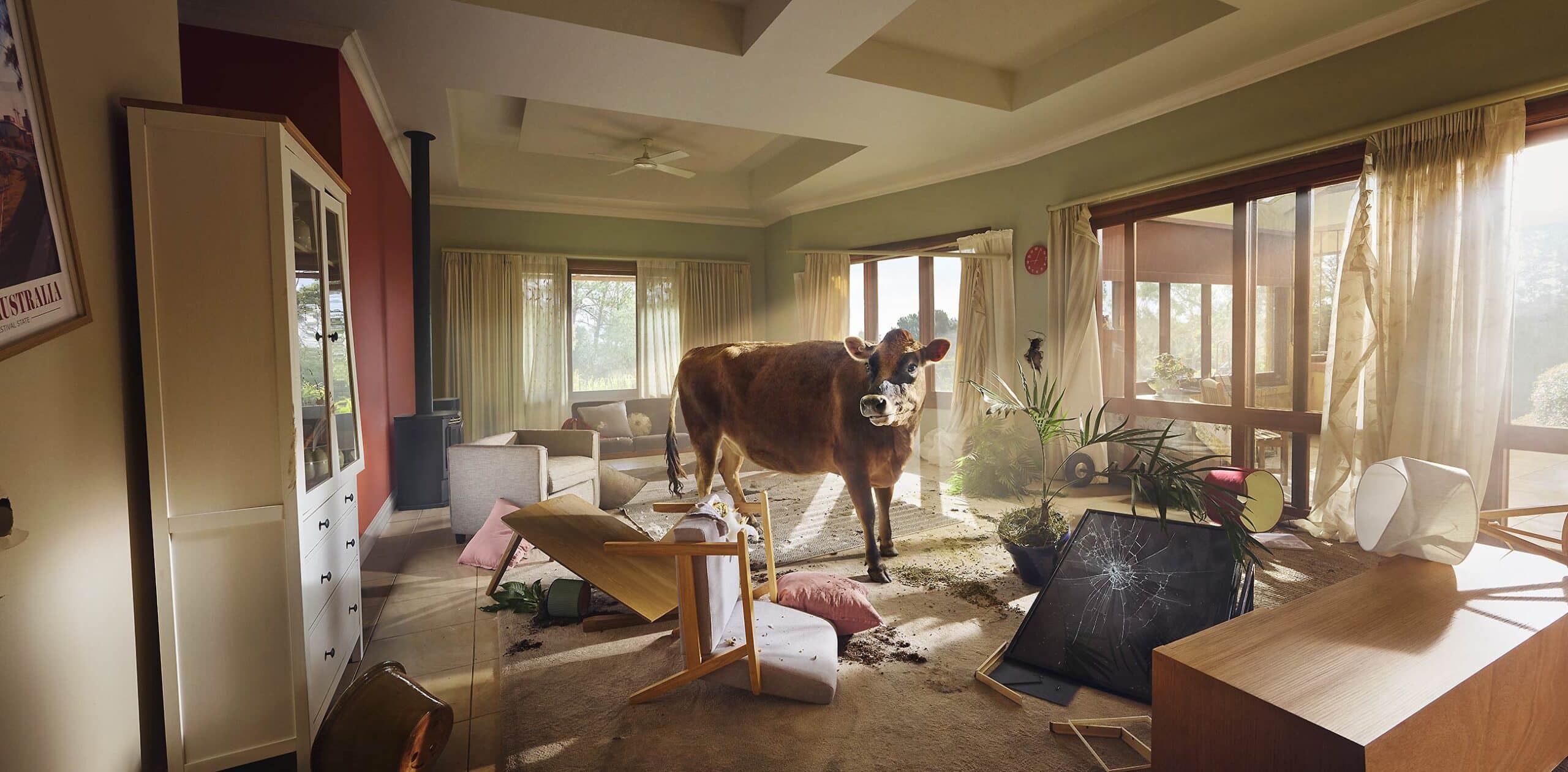
One frame does all the talking. Always great to be brought in on a strong idea
This is a custom heading element.
This was shot on a live TVC set, always a privilege, but it comes with real pressure. You step into a moving machine and the window for stills is incredibly tight.
Space was limited, so it meant working lean and staying nimble. Even assistants had to step out on this one. Multiple formats, separate plates, small elements, all captured without really being able to move much around.
At that point it’s about keeping it simple and getting through it. Experience helps.
I’ve always liked big images built around a strong idea, and this one had it. Simple, slightly absurd, and instantly readable. Exactly the kind of image I enjoy.
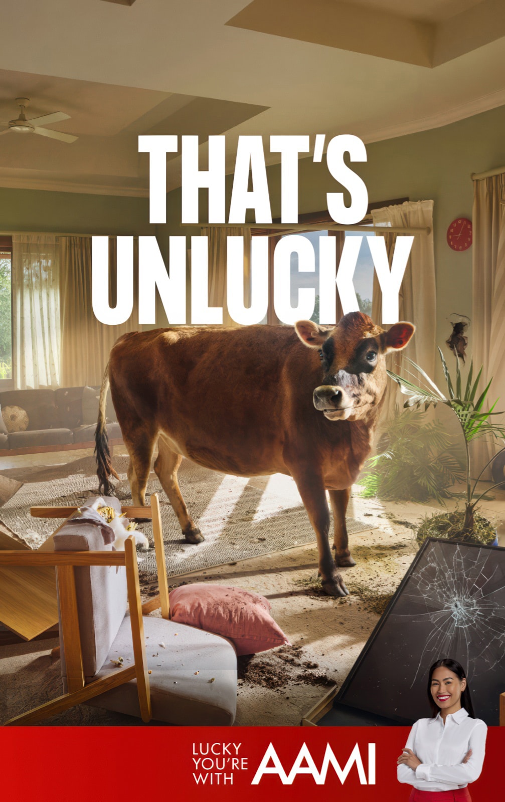
A strong idea that works in a single frame and carries an entire story. I’ve always loved working on briefs like that.
A strong idea that works in a single frame and carries an entire story. I’ve always loved working on briefs like that.

BRANDED CONTENT
This is a custom heading element.
High-end commercial work is still very much the core of what I do.
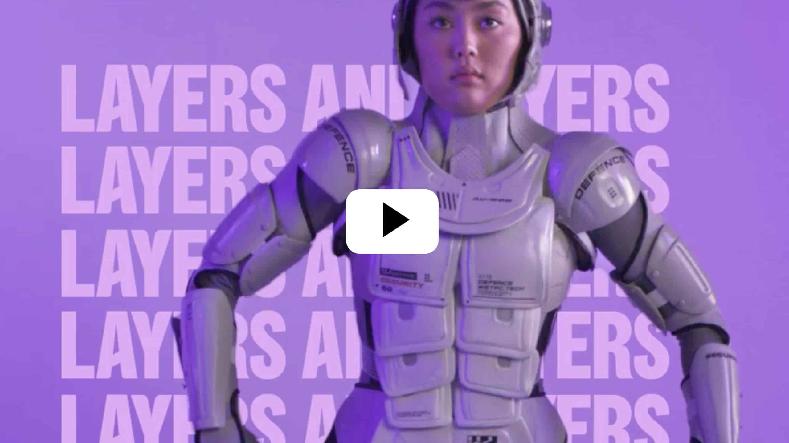
Alongside that, I also shoot branded content, social campaigns, interviews and product-driven work that often needs to move faster and work harder across multiple platforms.
The productions are usually leaner. Smaller crews, tighter timelines, more direct execution. I often shoot stills and motion together, keeping the process efficient and visually aligned.
But the approach itself doesn’t really change. The work still needs to feel human, well observed and properly crafted. Whether it’s a large campaign or a smaller content piece, quality is still the constant.
Clients include Westpac, Specsavers, Parramatta Light Rail, WorkCover, McDonald’s, IHG Hotels, Westpac Rescue, ReachOut and Domain, among others.
Photography can communicate incredibly fast
I think strong visual ideas cut through incredibly fast.
One image, one idea, immediate understanding.
I do believe strong visual ideas hold attention. A great concept, carefully executed with enough scale, craft and presence to genuinely connect with people. I don’t think the goal is perfection.
The goal is conceptual clarity. Creating imagery that feels memorable, believable and emotionally real.
Today we are surrounded by endless content and increasingly generated imagery. AI is becoming an important part of modern image-making and workflows, and it is an incredibly powerful tool. But I also think audiences are becoming far more visually aware. People recognise when imagery feels generic, over-generated or emotionally empty. They also recognise craft.
That’s why I think distinctive imagery matters more now, not less. It comes from strong concepts, production experience and understanding how to execute ambitious visual ideas in a way that still feels human and believable.
Some ideas simply carry more weight when they are physically built. Real locations, real talent, practical effects, constructed environments and carefully shaped light all contribute to imagery with texture, credibility and presence. People remember distinctive imagery.
___________________________________________
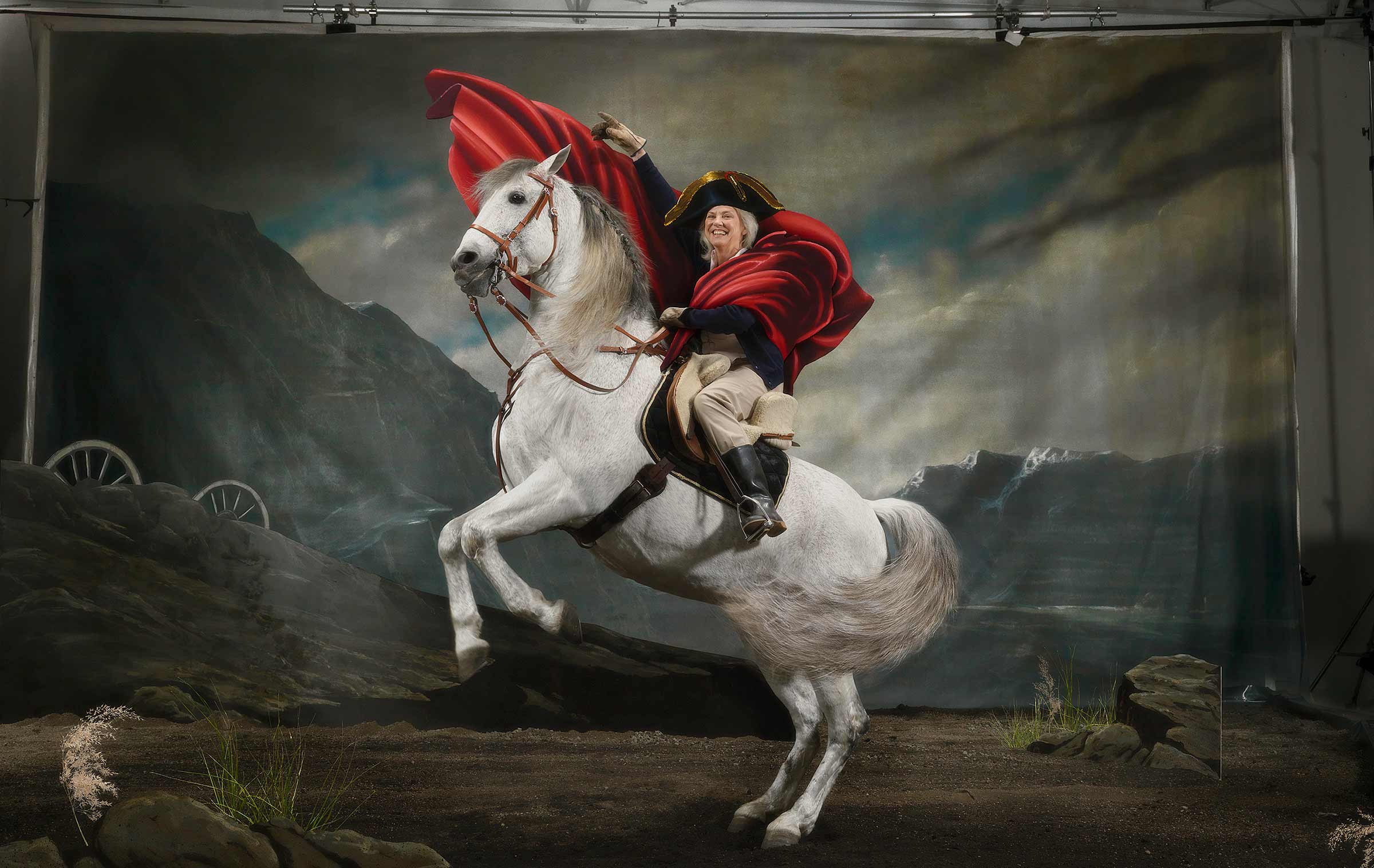
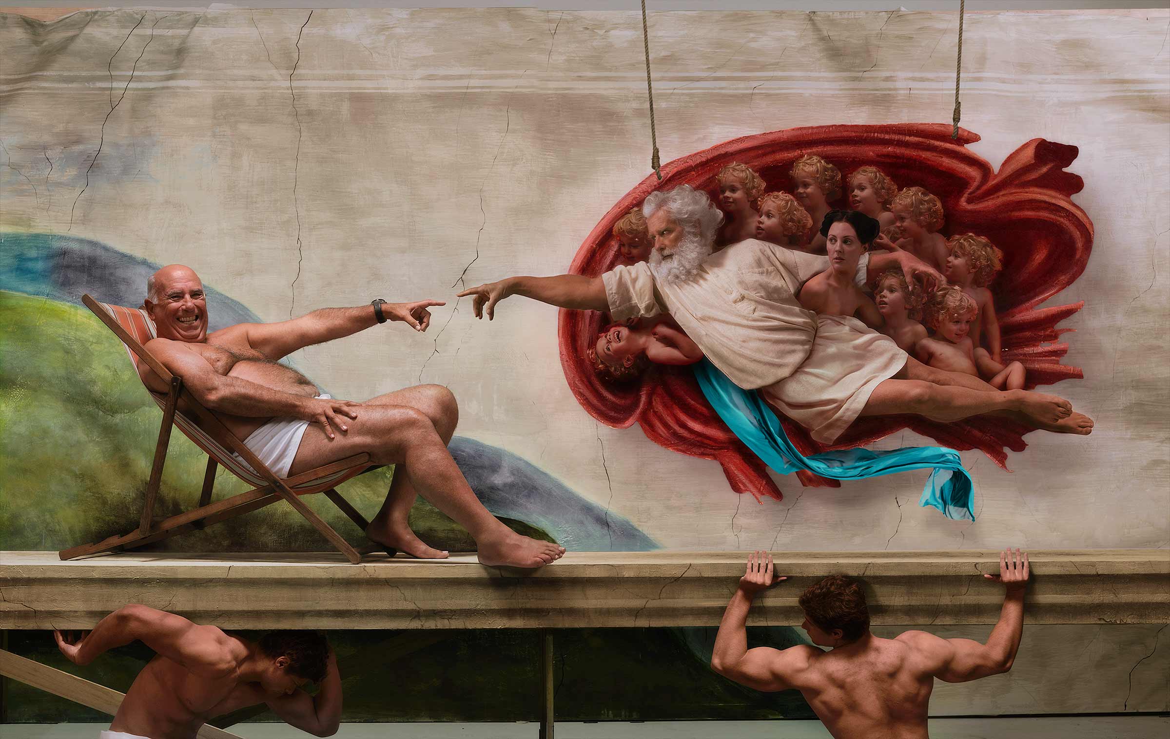
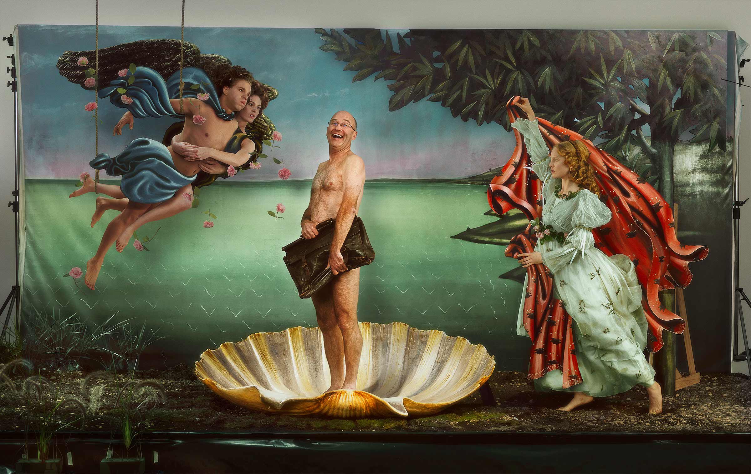
This was a campaign for a medical product connected to heart health and recovery, built loosely around the idea of rebirth and second chances.
The original brief was actually to use the famous artworks directly and retouch a real person into them. Early on we discussed that this would probably feel a little too respectful, and potentially backfire creatively. So instead we decided to build completely new versions inspired by the original paintings, but centred around real people and a slightly stranger sense of humour.
Everything was photographed practically. Massive painted canvas backdrops, around 12 by 8 metres, were hand-painted for us by an artist who had previously worked on Titanic with James Cameron. The entire project was essentially one large constructed set.
I still love the ambition and absurdity of these images. They feel handcrafted, theatrical and very physical, which was exactly the point.
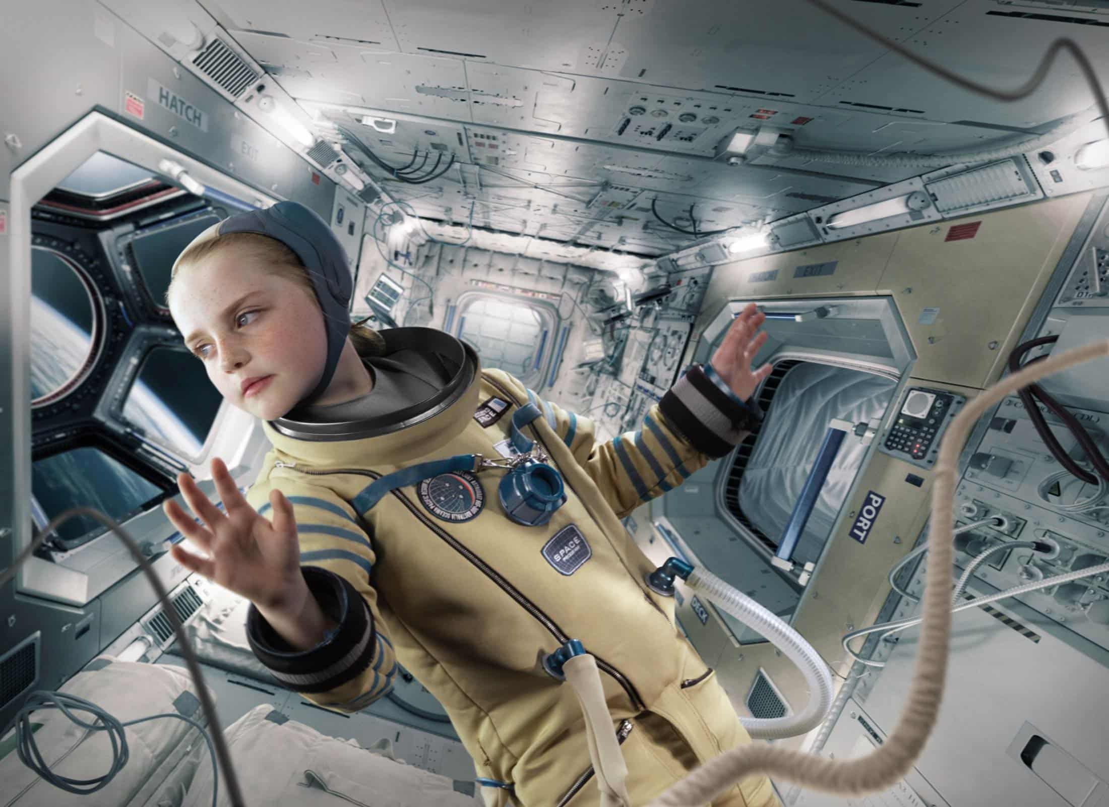
This image was created for CommBank around the simple idea hidden inside their own logo, CAN. The campaign featured children imagining themselves in inspiring future roles, astronauts, pilots, doctors, firefighters and more. I always loved the optimism and scale of this image. A big conceptual idea, built physically and photographed for real.
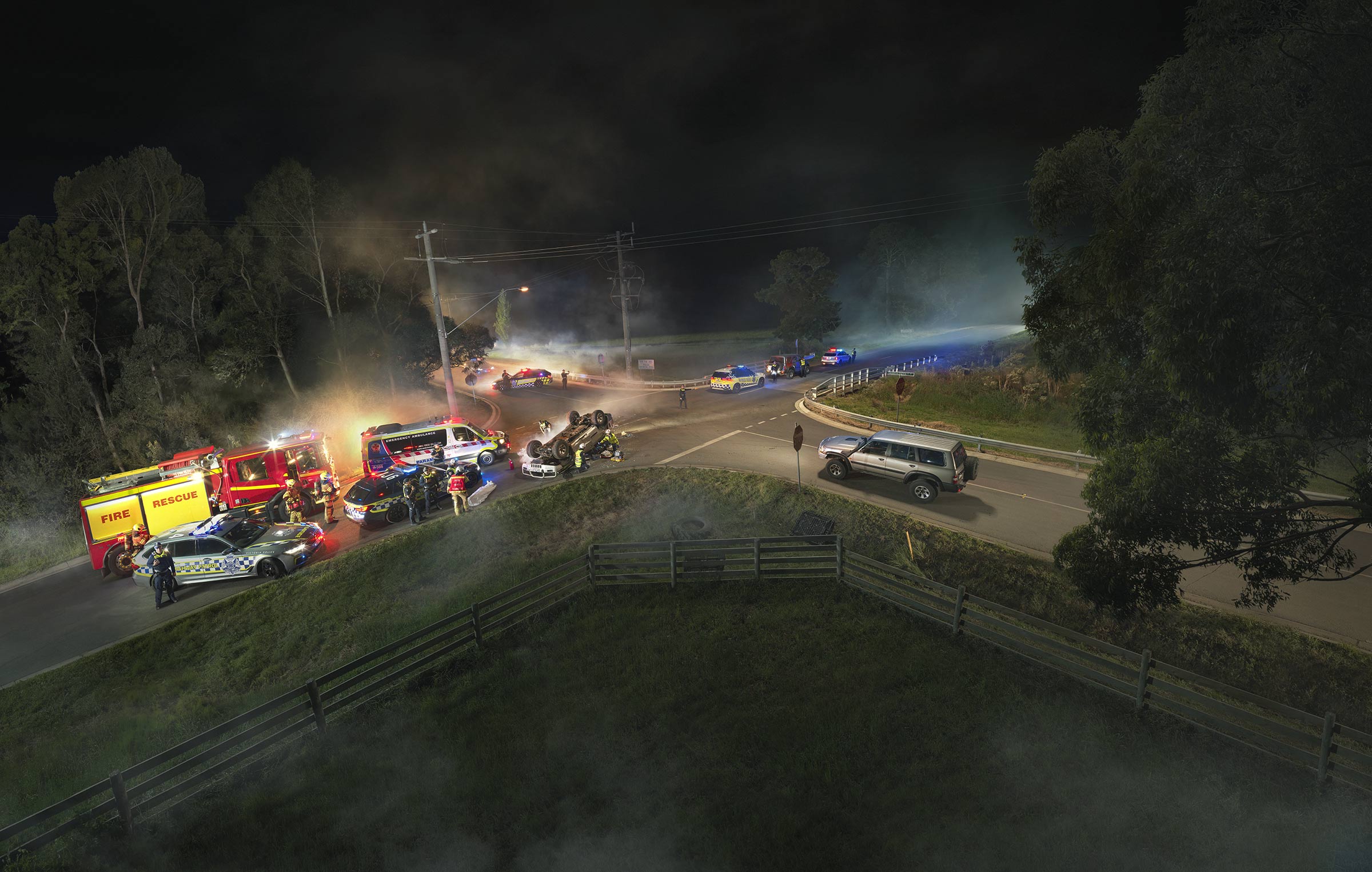
Created for TAC Victoria around the idea that every decision on the road carries consequences. One moment, one choice, and everything changes.
The entire scene was built practically and photographed in camera during a large-scale overnight shoot involving emergency services, police, fire crews and a substantial production team.
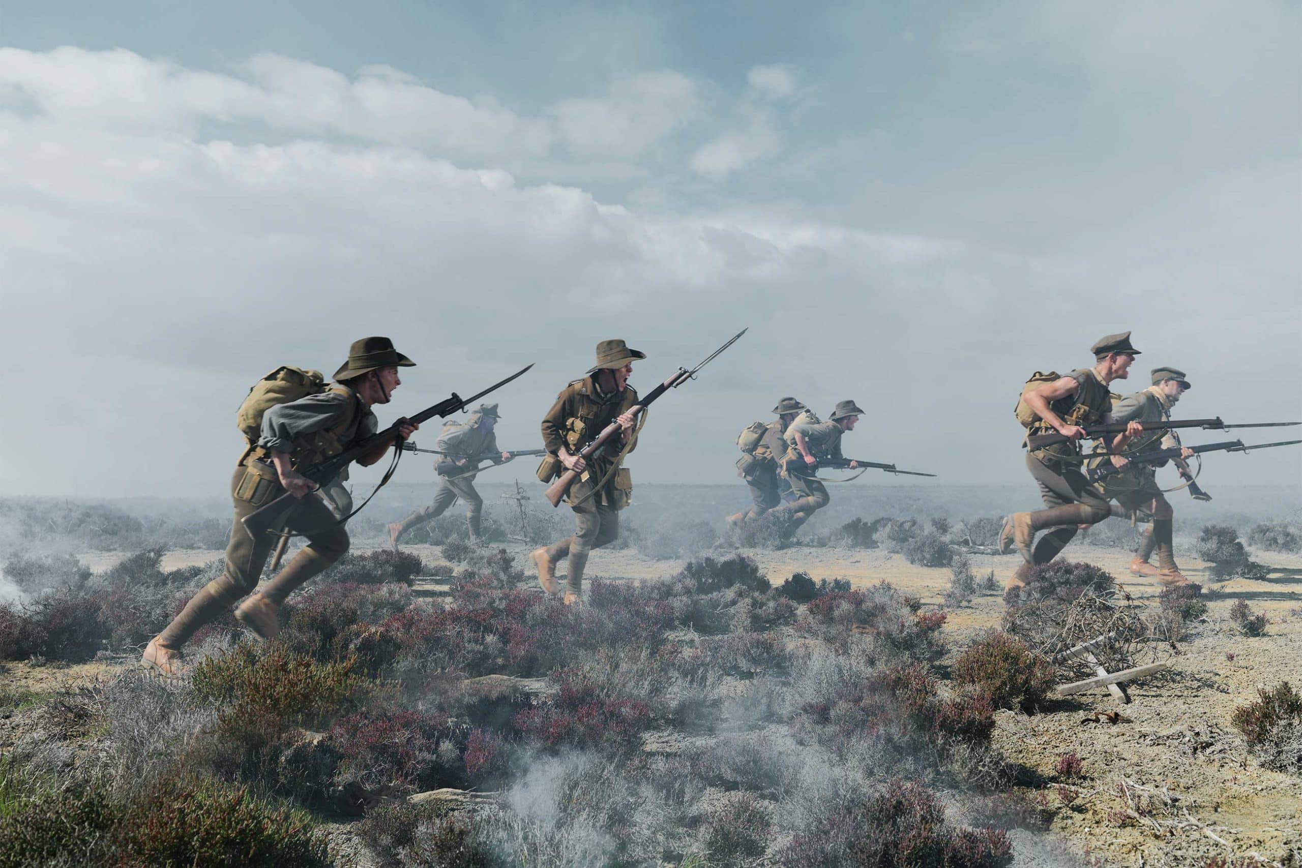
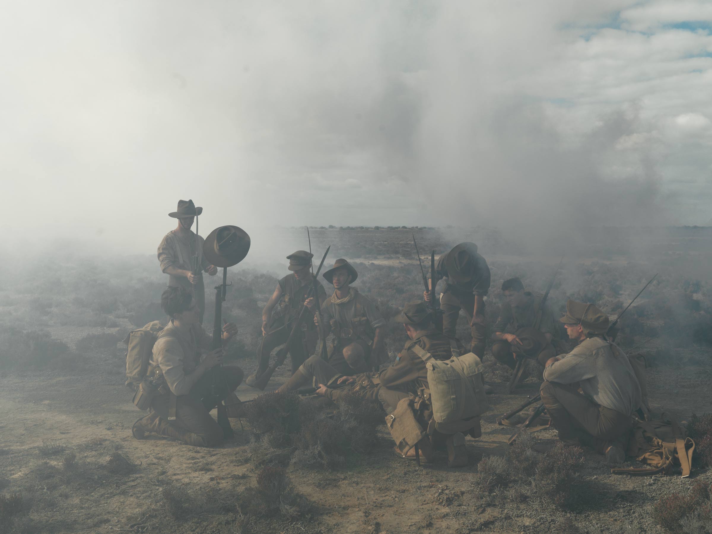
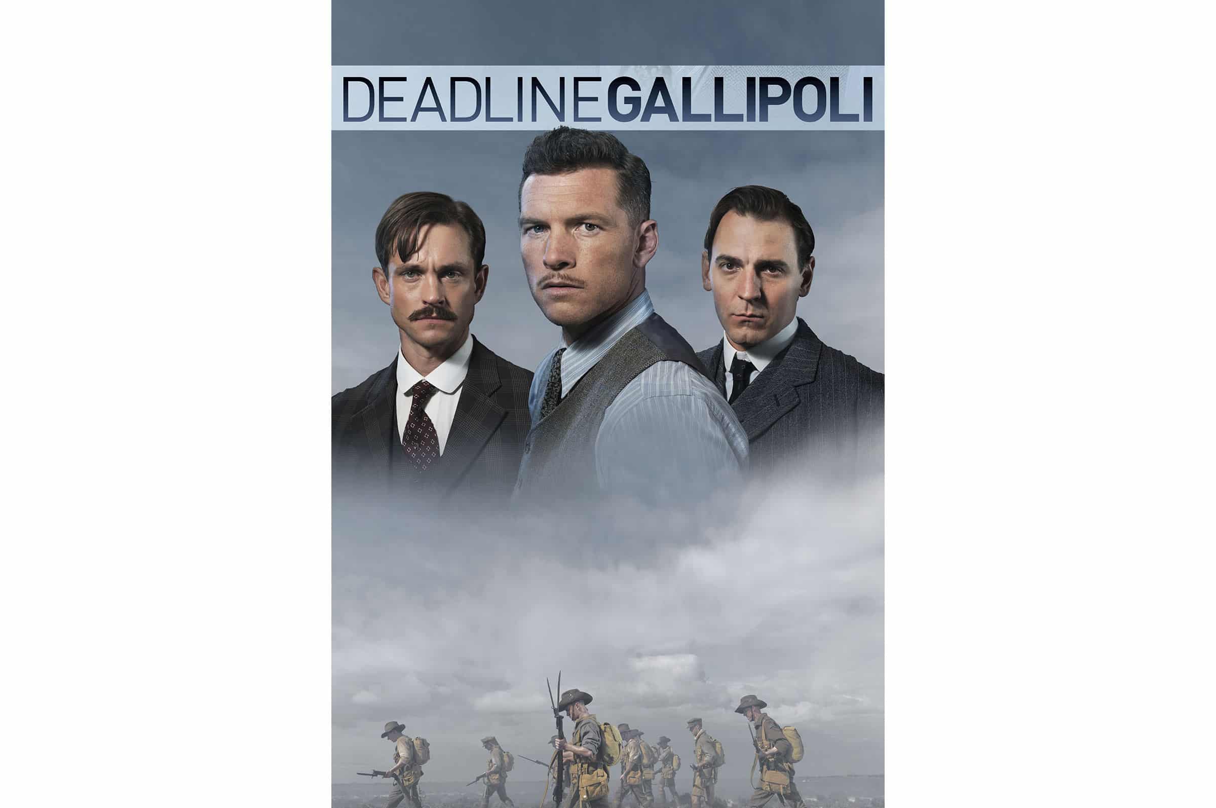
Shot for SBS around Deadline Gallipoli, inspired by the photography of war correspondent Ellis Ashmead-Bartlett. One of the key images recreated his famous photograph of soldiers charging across the battlefield.
We photographed the campaign in remote South Australia using large-scale practical effects, massive smoke machines and large film lights to create something that felt cinematic, timeless and physically real. I loved the scale of the production and the atmosphere we were able to build in camera.
The series featured actors including Sam Worthington, alongside the wider cast and extras from the production, photographed both in constructed battlefield scenes and more stripped-back portraits.
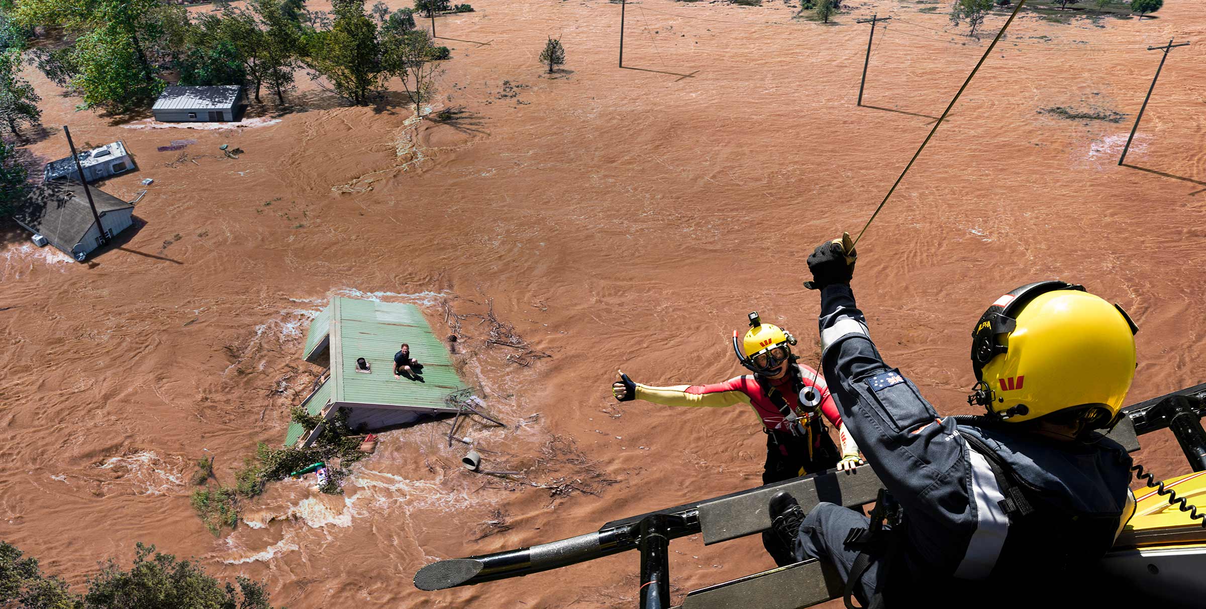
This epic image really says everything about the scale and intensity of natural disasters in Australia.
Photographed for Westpac Rescue, it captures a real moment with a kind of scale that almost feels cinematic. I always loved how timeless the image feels. The tiny human figures against this vast flooded landscape gives it real weight and presence. There’s something about scale that stays with people and makes the image memorable.
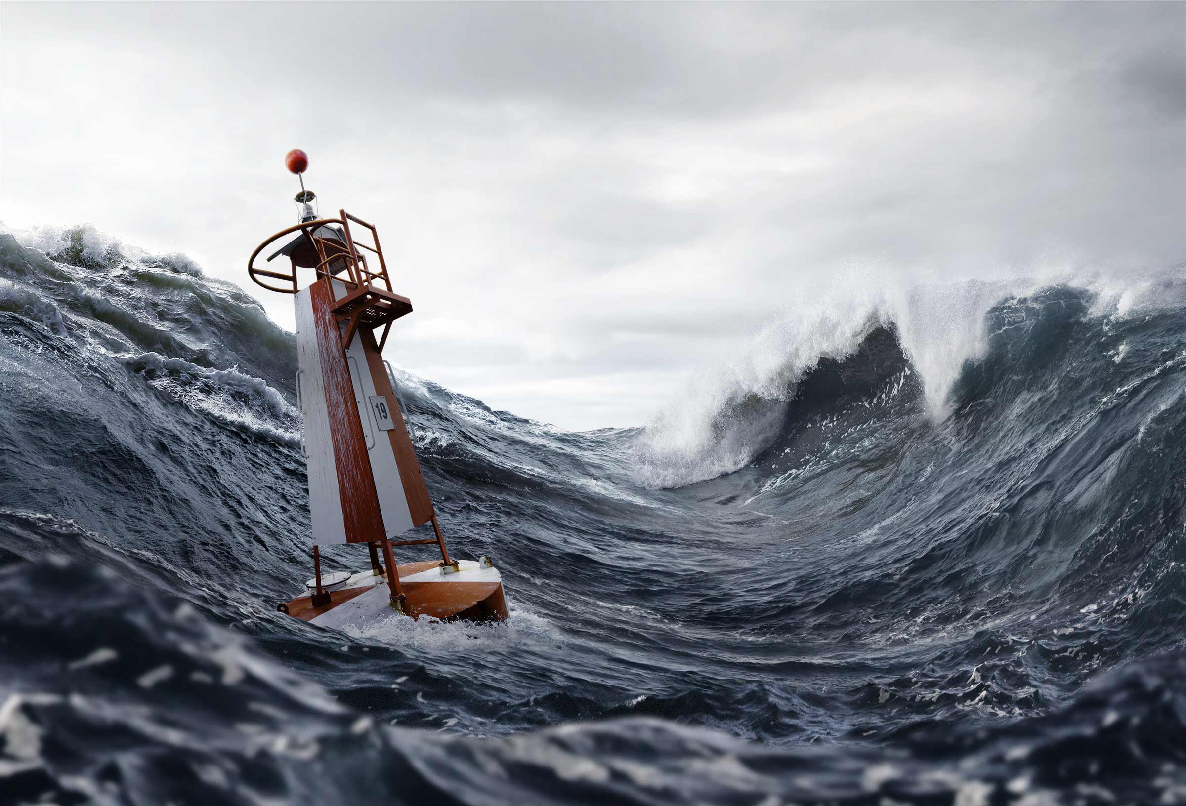
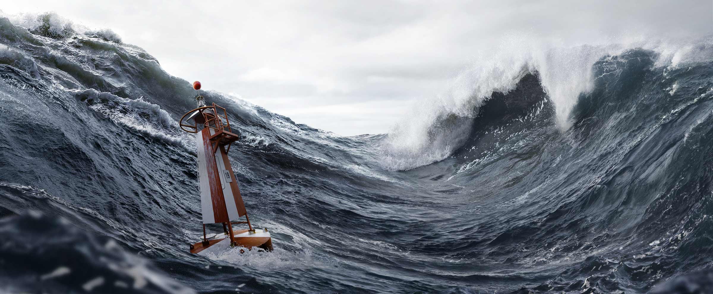
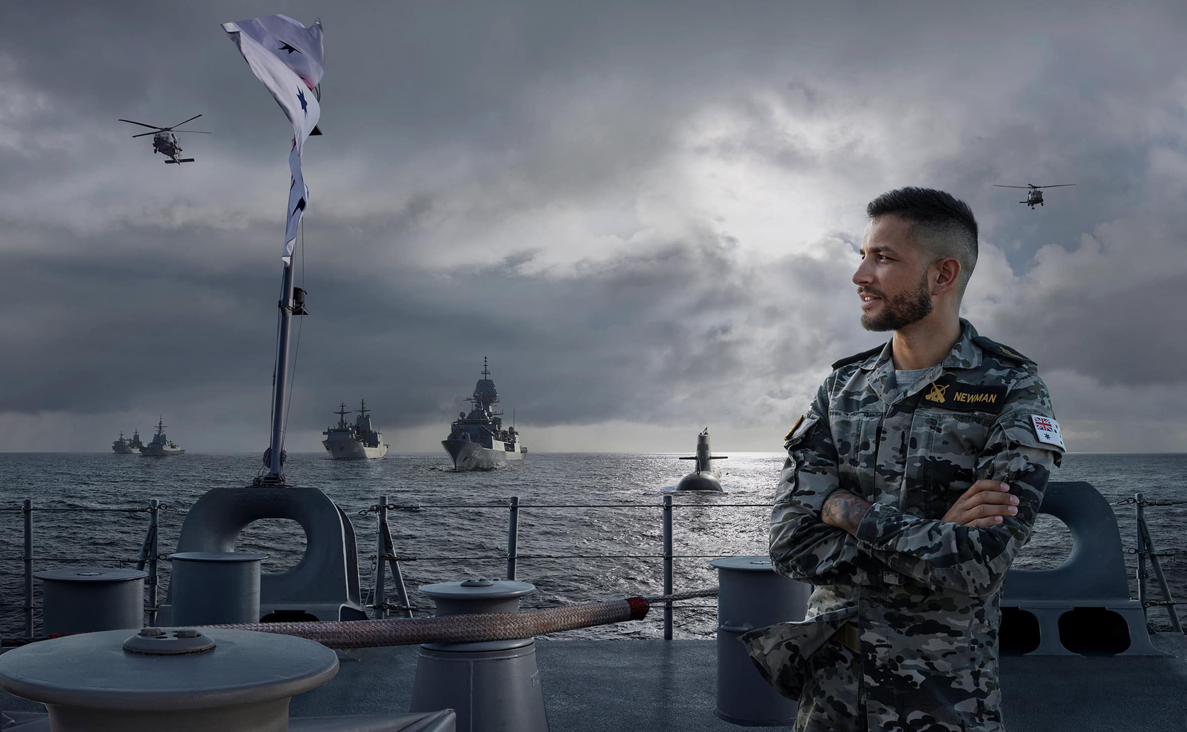
Photographed for the Australian Navy, this image is remarkably calm and yet tells a very big story. One person, one extraordinary environment.
I love that it never feels overplayed. The scale of the sea, the ships and the sky does all the work. It tells a big story, but it does it without shouting loudly.
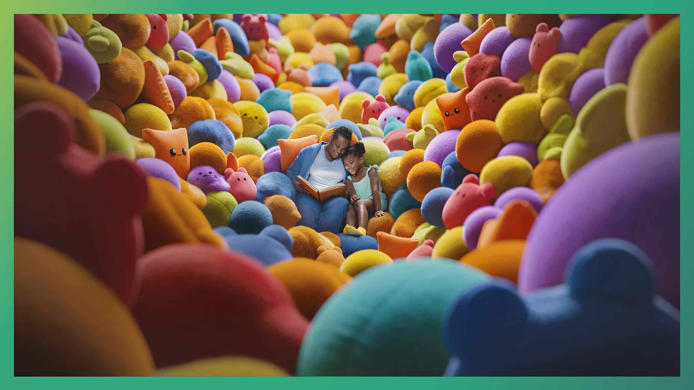
Photographed in New York for Dupixent, this campaign was built around the overwhelming physical and emotional world of severe eczema and particularly how children experience it.
I always loved the sheer scale and immersion of the image. The soft toy landscape almost feels endless and cinematic, creating a world that completely surrounds the child. It’s playful and warm at first glance, but there’s also something slightly overwhelming about it, which was exactly the point.
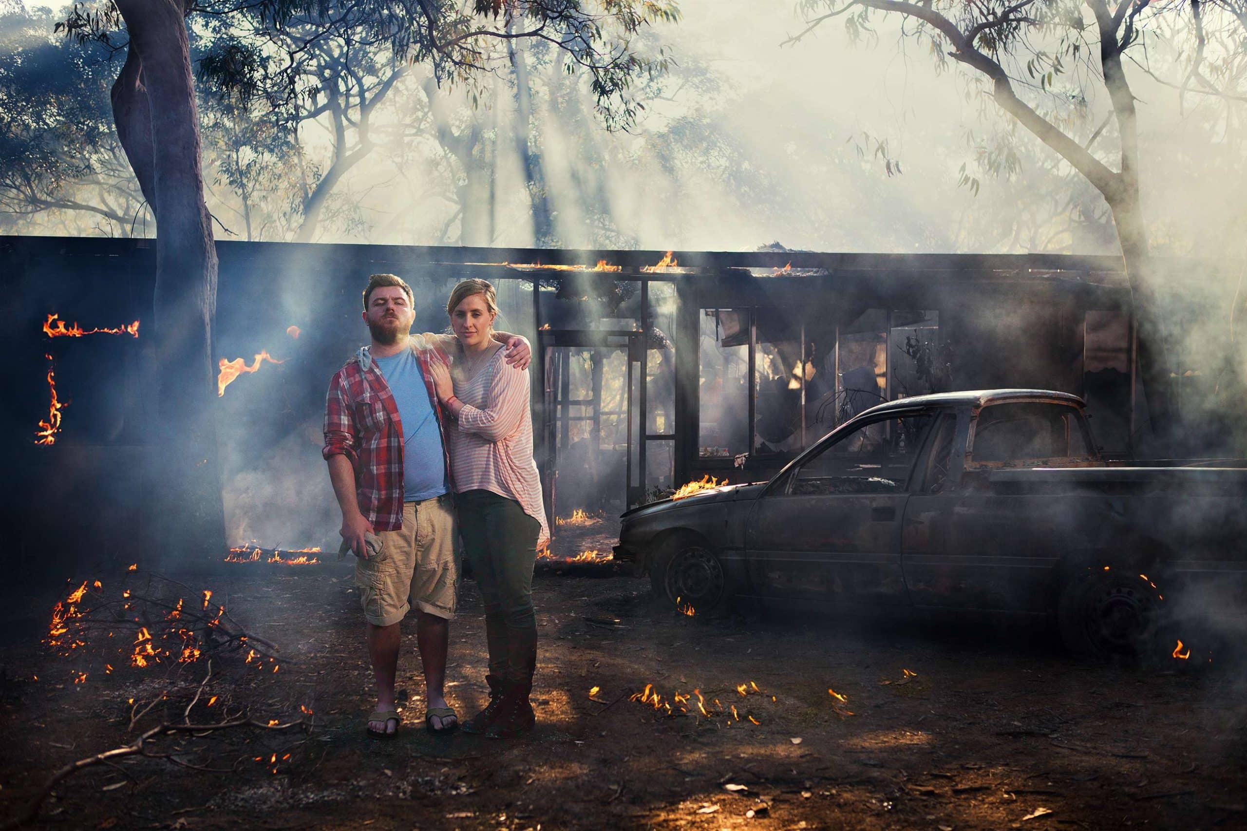
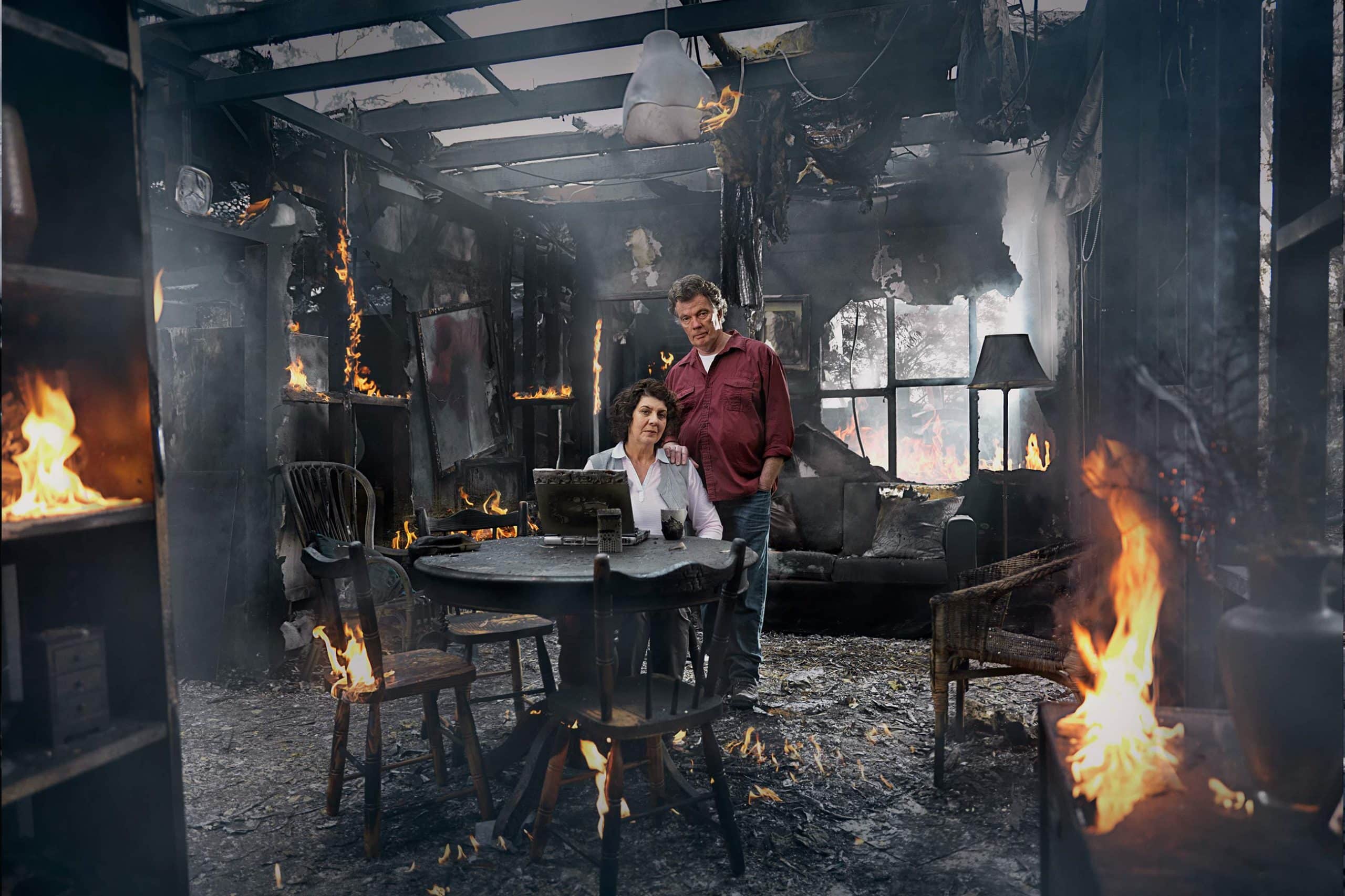
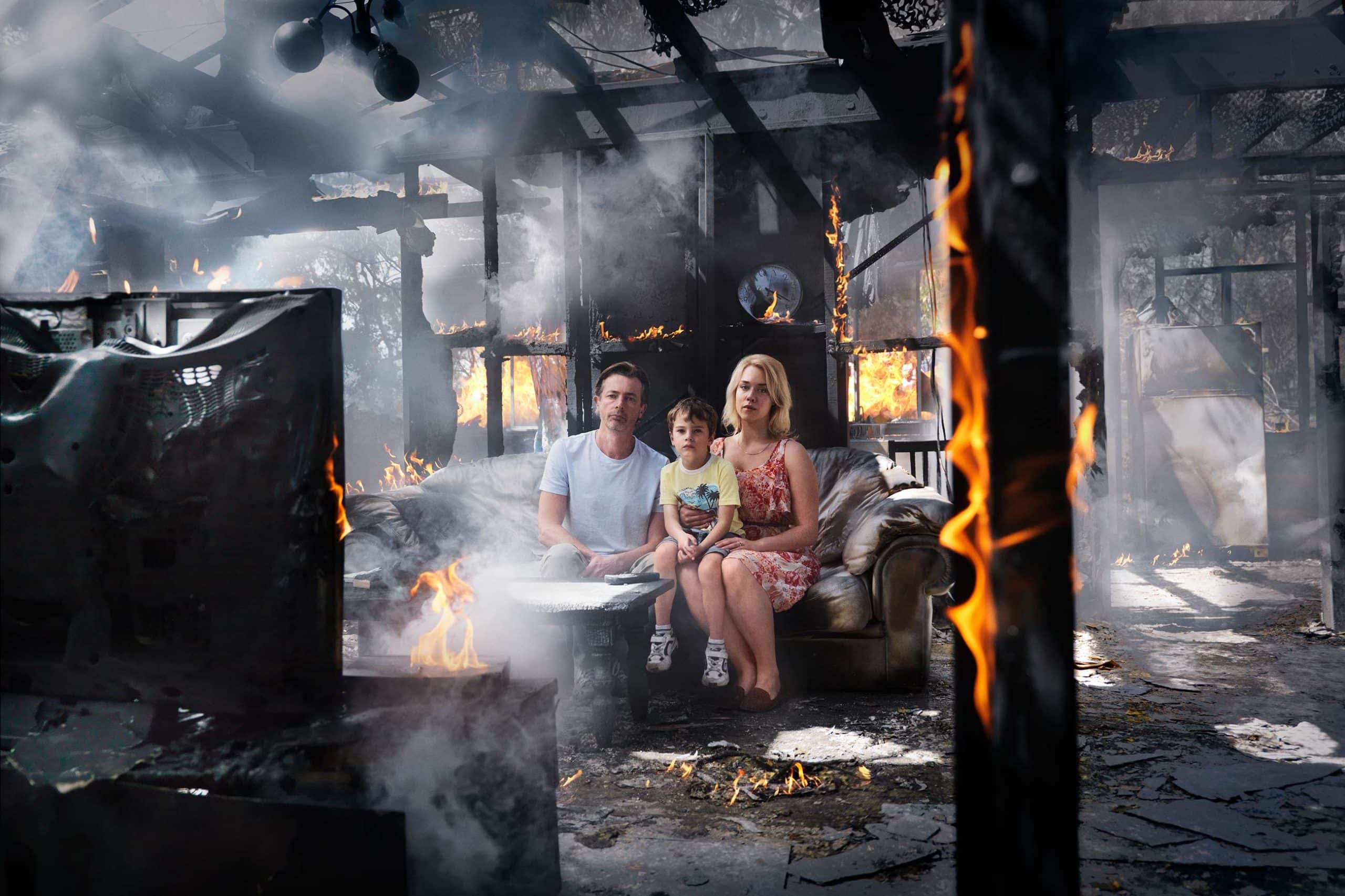
This series for the New South Wales Rural Fire Service focused on the reality behind the headlines and the devastating sense of loss that bushfires leave behind.
Everything was built practically and photographed in camera, using controlled fire, smoke and partially constructed sets to create these burnt interiors and landscapes. I always loved the contrast between the chaos of the environment and the stillness of the people inside it.
The images feel cinematic, epic and emotionally heavy, but the performances were deliberately restrained and real. That balance is what gave the campaign its weight and memorability.
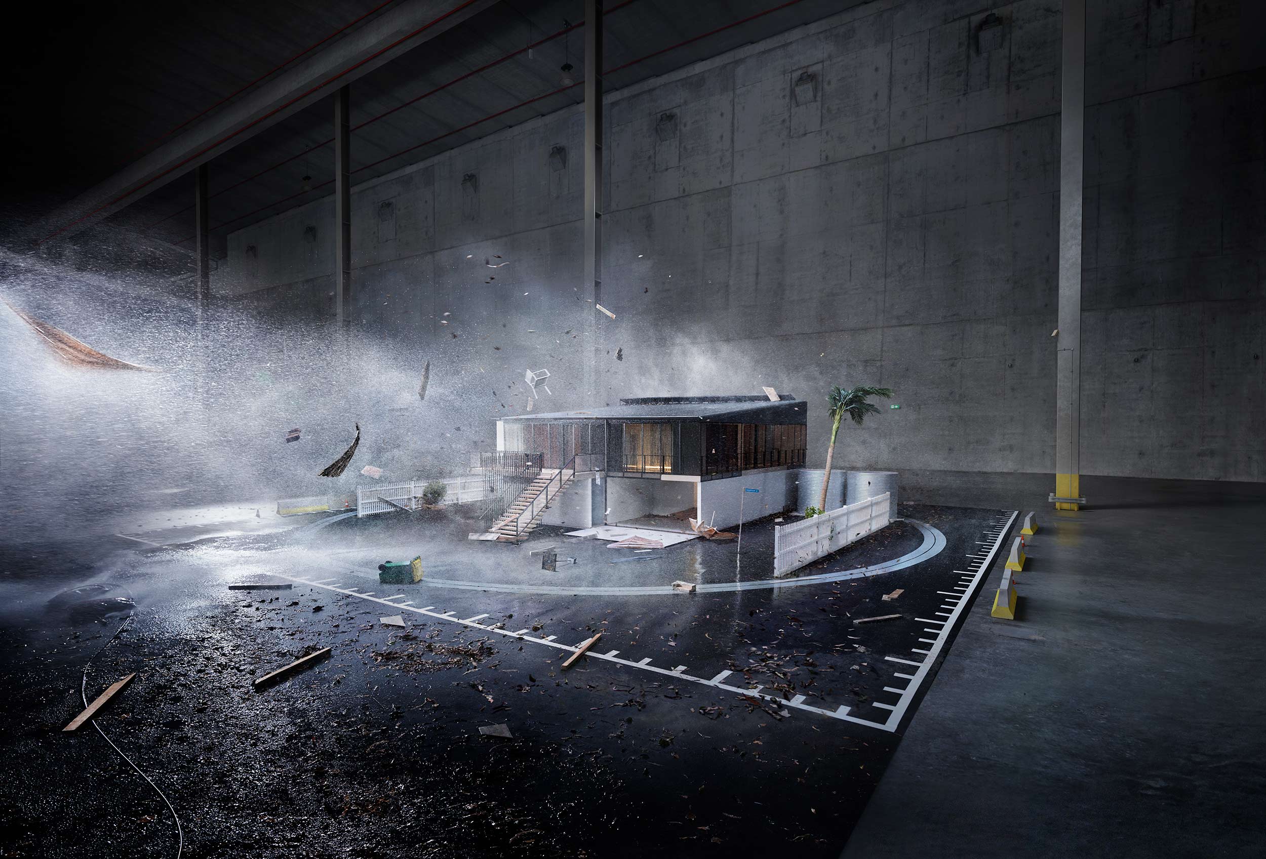
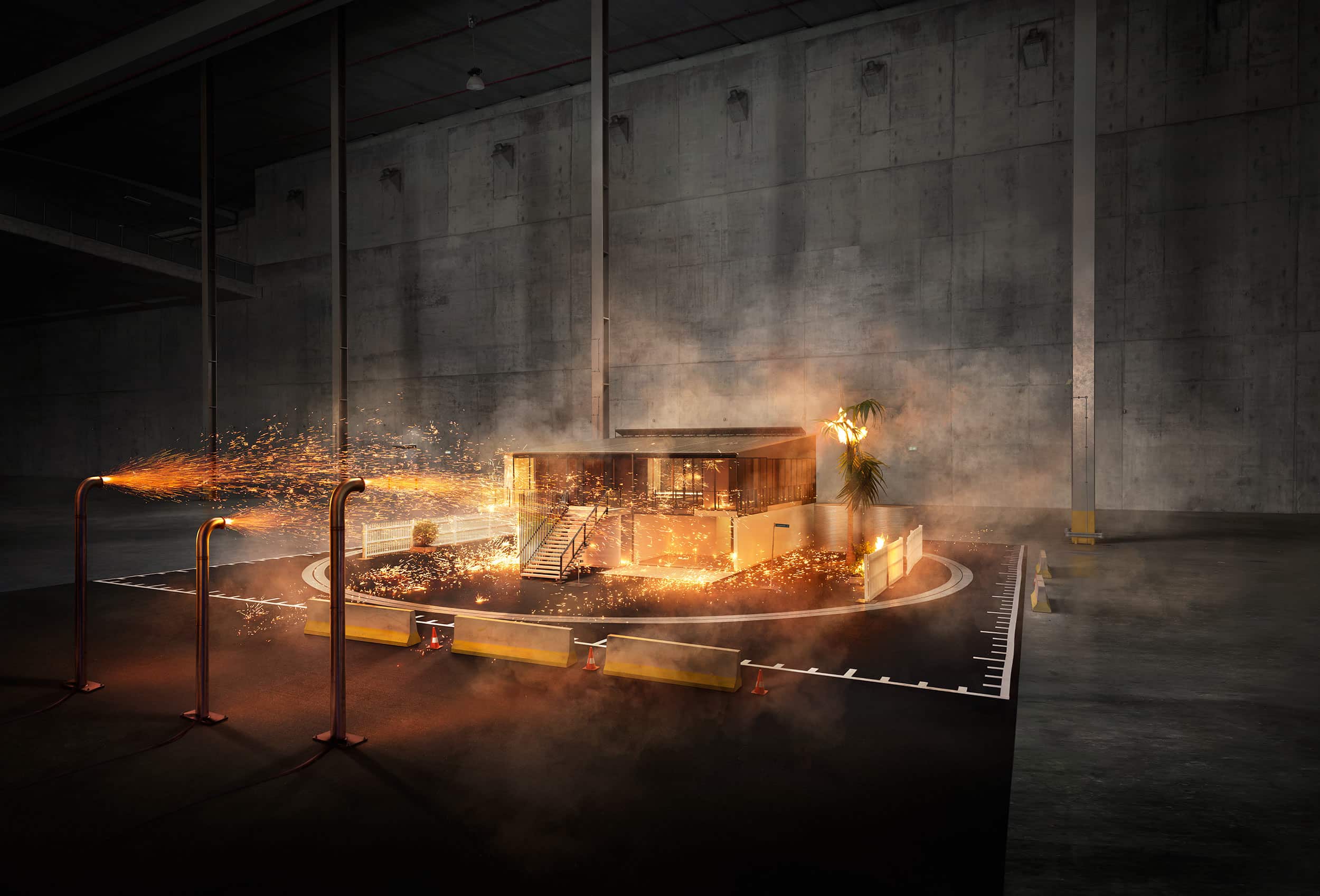
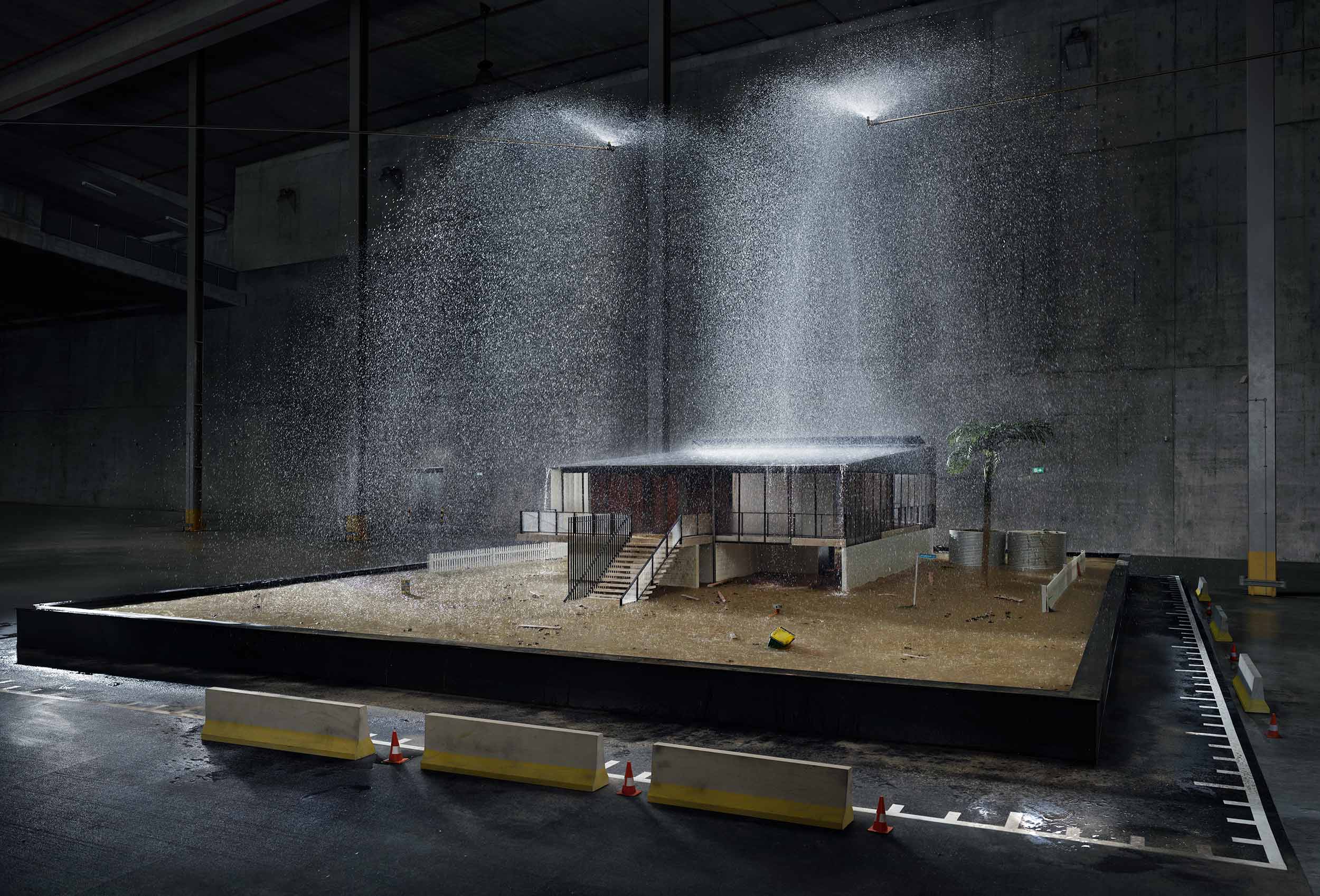
This Suncorp campaign was built around a brilliant real-world idea. Inspired by full-scale disaster testing facilities in the US, the concept explored what a truly resilient Australian home could look like against floods, cyclones and fire. The original plan was to photograph the real testing facility, but instead we built detailed miniature sets and photographed them practically, combining them with large-scale environments and effects work to create the illusion of full-sized houses under extreme conditions.
I always loved the simplicity of the idea. One house, pushed to its limits, photographed almost like a scientific experiment.