


A stills campaign shot around Australia
This is a custom heading element.
This was a fantastic project where one frame carries a really big story. There’s a real strength in something that doesn’t move, doesn’t flash, just sits there and holds your attention.
I’ve been fortunate to work with the Australian Navy and Army a few times over the years, but this one really stood out.
The job ran alongside a TVC that was more lifestyle driven. Within that, we carved out a stills campaign for outdoor that needed to be far more controlled and precise.
We moved across the country to make it happen. Perth, Townsville, Sydney Naval Base. Capturing elements piece by piece, ships, aircraft, helicopter-to-helicopter, different locations, different times, all brought together with a lot of precision.
The aim was to create images that feel composed but still have impact. Something that reads clearly and holds presence.
On every job, I want the work to perform, that’s a given. But there’s also a personal side to it. Call it job satisfaction. And this one had a lot of that.
Hovering in a helicopter, about 12 metres above the sea, watching a submarine disappear beneath you, that stays with you.
So yes, job satisfaction matters. You could say it doesn’t affect the outcome, but I don’t think that’s true. Pride in the work shows, and that only really happens when you’re there, actually shooting it for real.


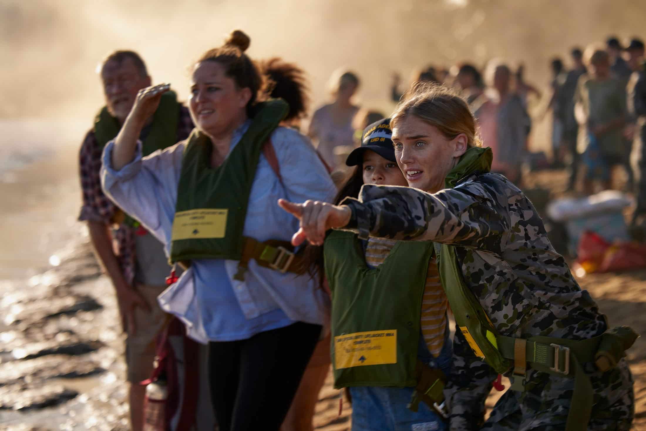


For this project, we split it into two worlds. One side was highly constructed, high-end outdoor imagery. The other lived fully in the lifestyle space, real moments, more observational. Two approaches, but designed to sit together.
For this project, we split it into two worlds. One side was highly constructed, high-end outdoor imagery. The other lived fully in the lifestyle space, real moments, more observational. Two approaches, but designed to sit together.

Presence over polish
This is a custom heading element.
I’ve been fortunate to work across a wide range of automotive brands, from Lexus and Toyota to Audi, Deepal, GWM, VW and BMW, to name a few.
Car photography moves quickly. It’s less about chasing a particular look and more about finding the right approach for each brand and each campaign, the idea, the layout, the intent behind the image.
What matters most is presence. The car has to feel real, it needs a sense of weight to it.
With so much CGI, Photoshop and AI in the mix, it’s easy for things to become a bit overworked or overly polished. That’s when cars can start to lose that sense of weight and feel almost like small scale models.
That’s something I’m always mindful of.


The car has to feel like a car. It either feels real, or it doesn’t. Presence is everything, especially now, when we’re flooded with images.


Cars come alive when they’re actually moving. I love shooting car to car, it’s something you don’t see that often anymore. For me, it shows a car doing what it’s built for, being driven.


The car has to feel like a car. It either feels real, or it doesn’t. Presence is everything, especially now, when we’re flooded with images.
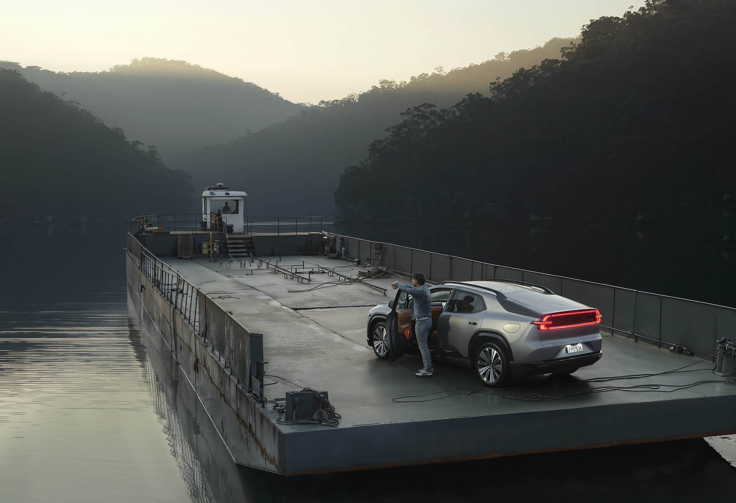


It all depends on the campaign. Sometimes it’s highly constructed, with a precisely lit car. Other times it’s about capturing a more natural moment. The approach is always driven by the idea and the creative behind the campaign.
If it feels set up, it’s already lost
This is a custom heading element.
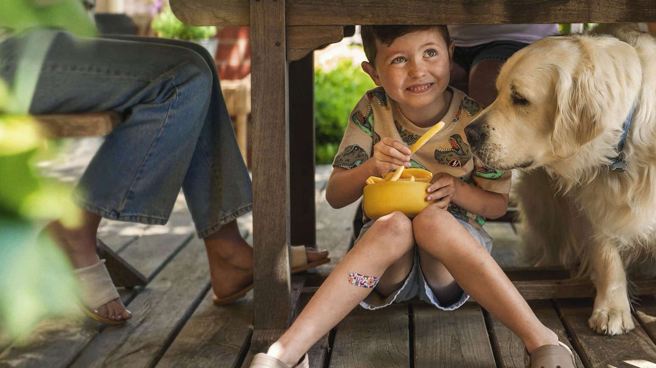
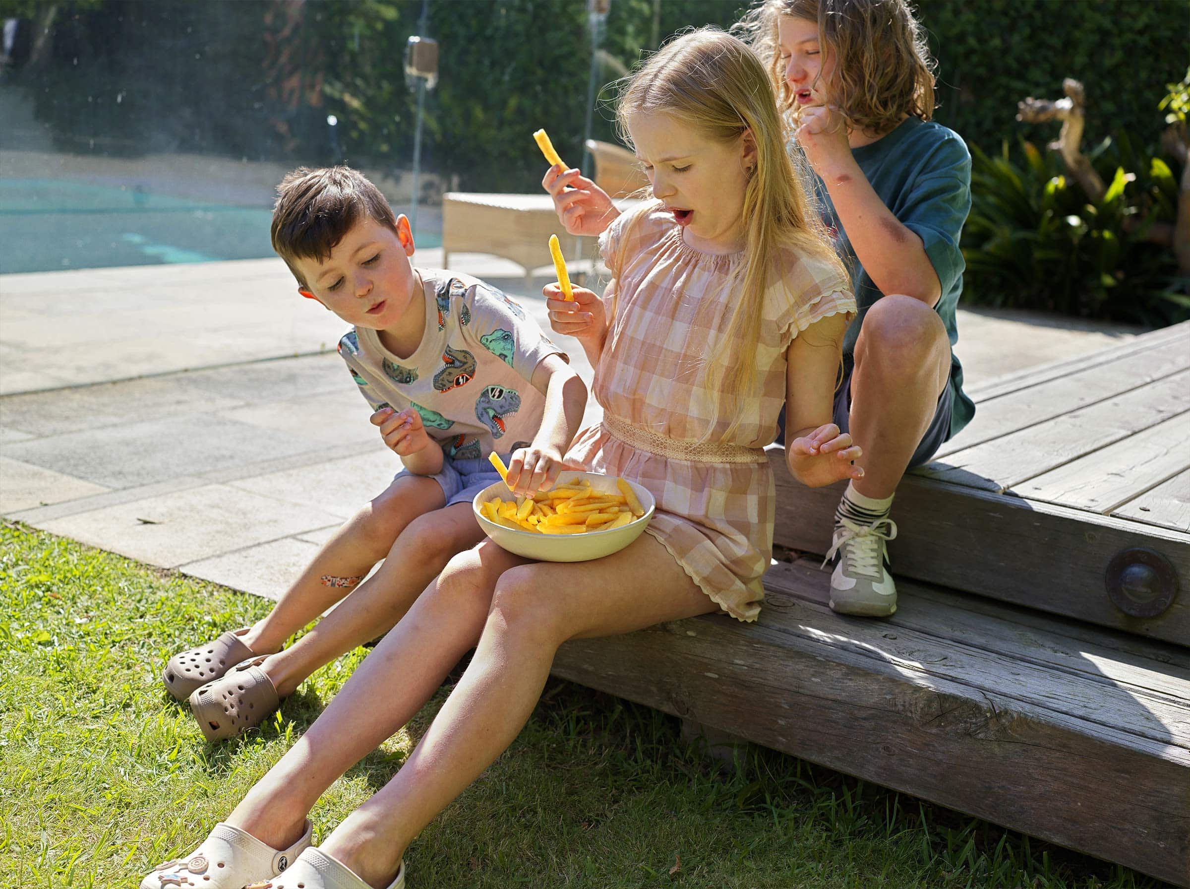
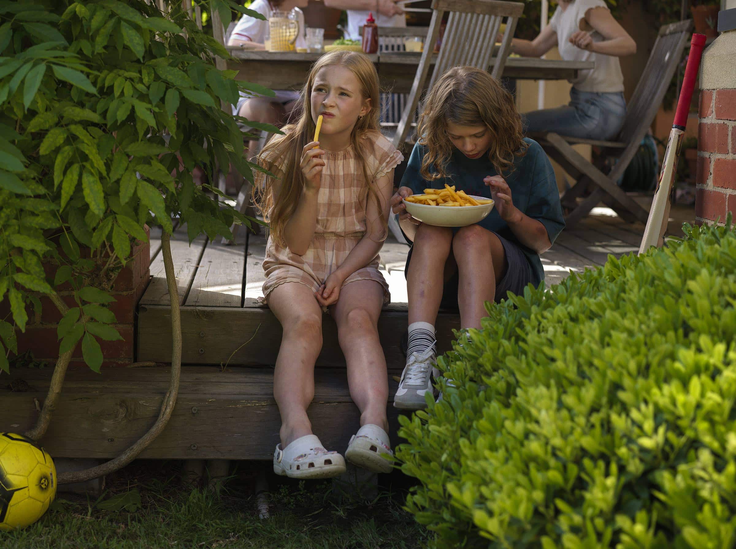
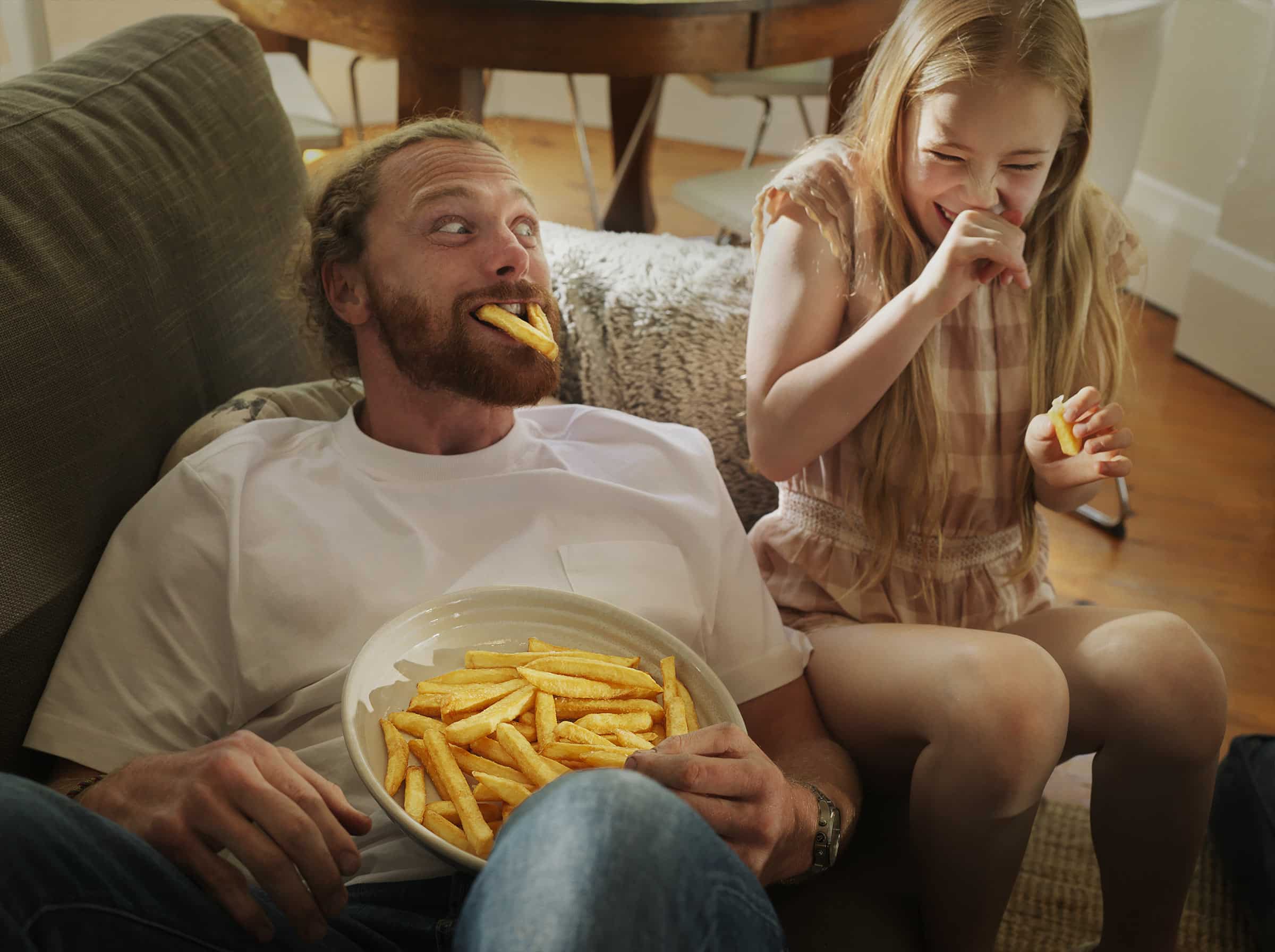
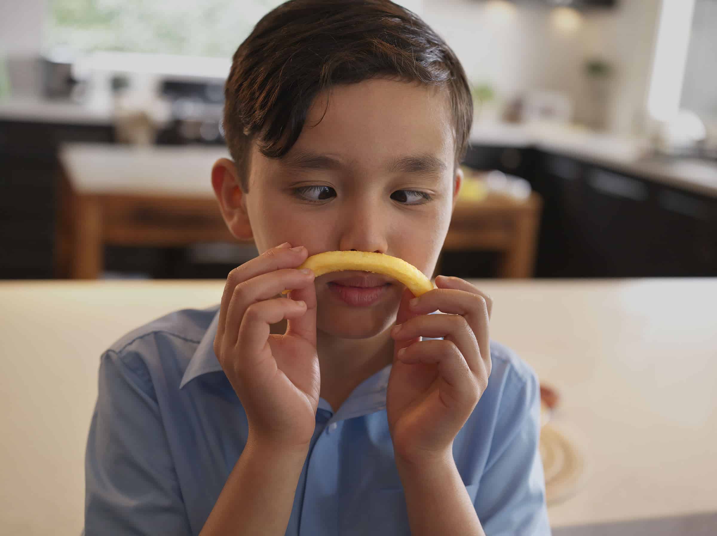
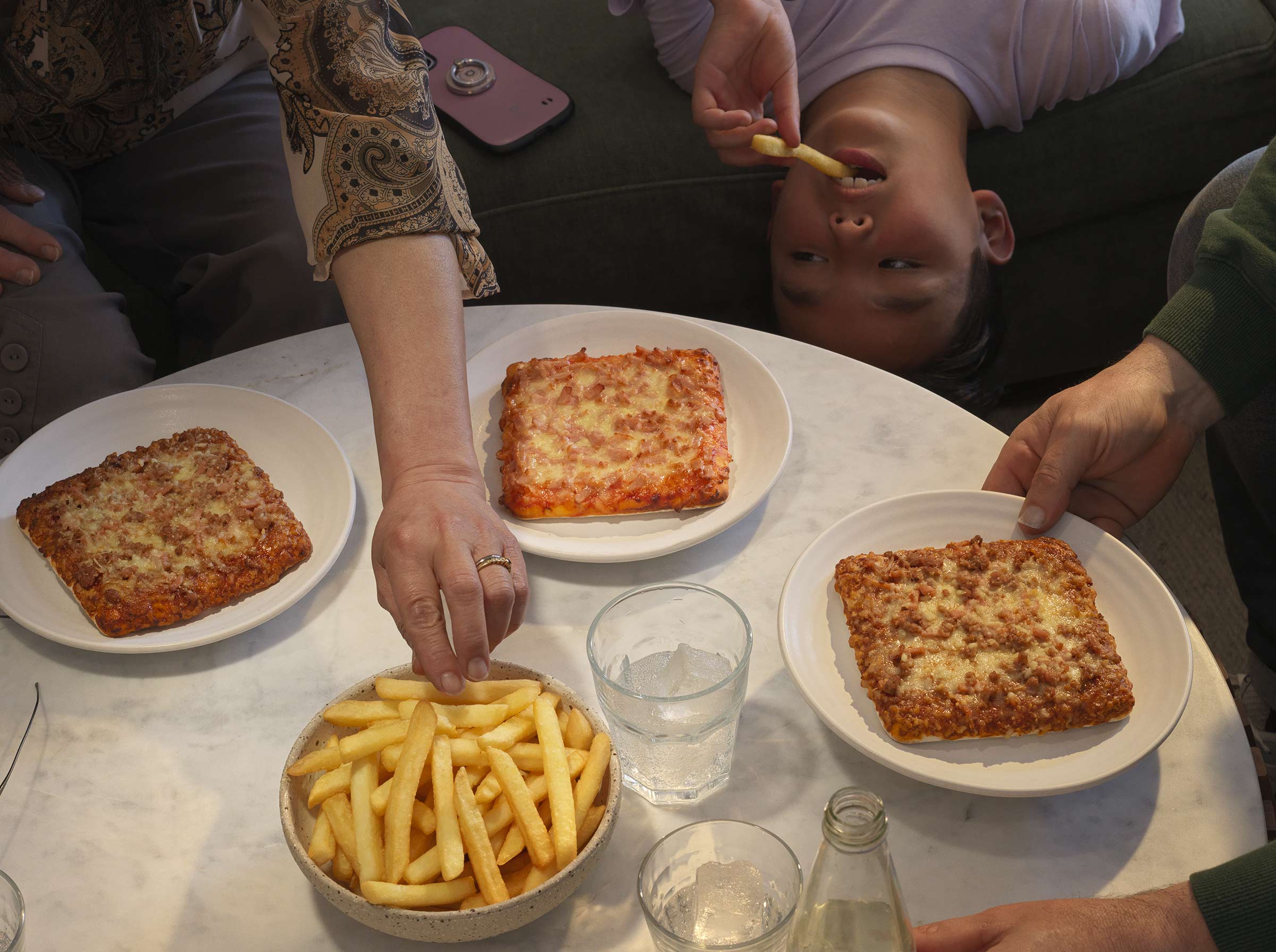
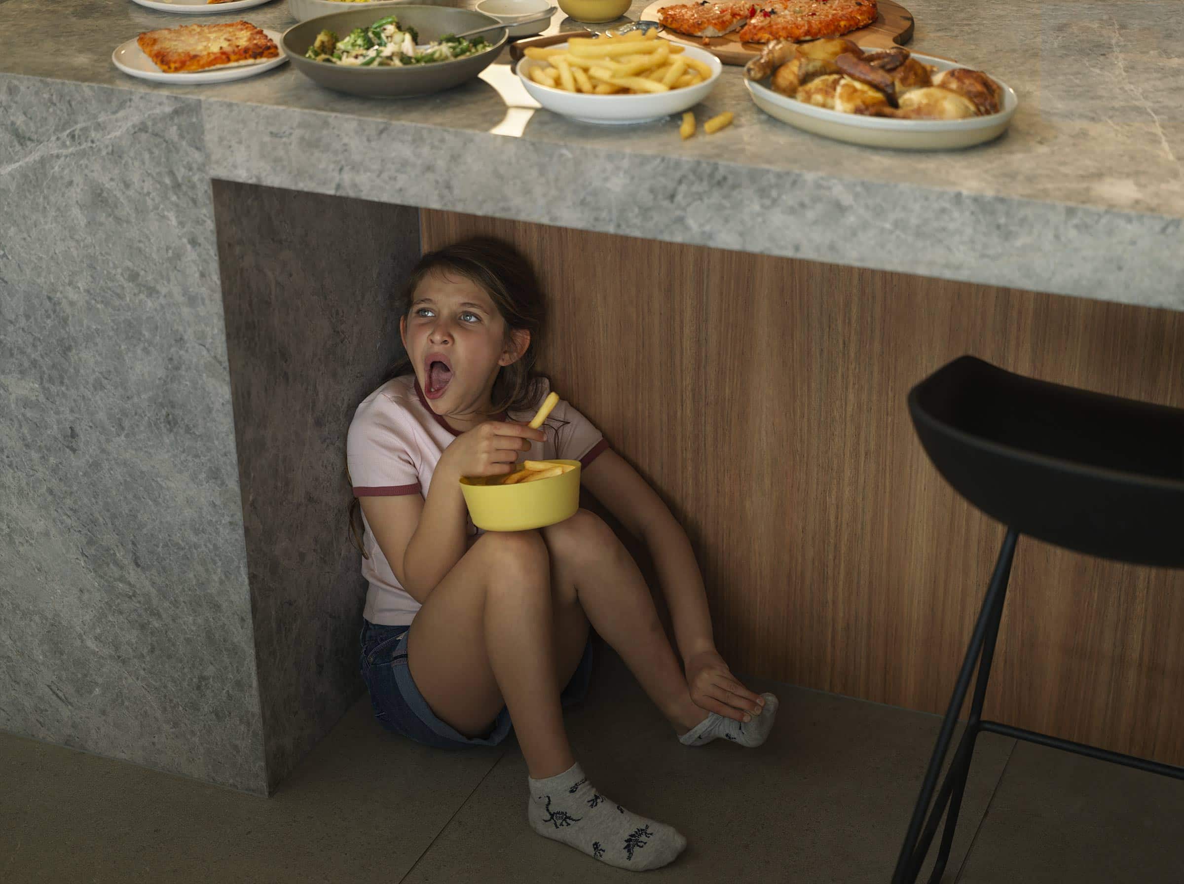
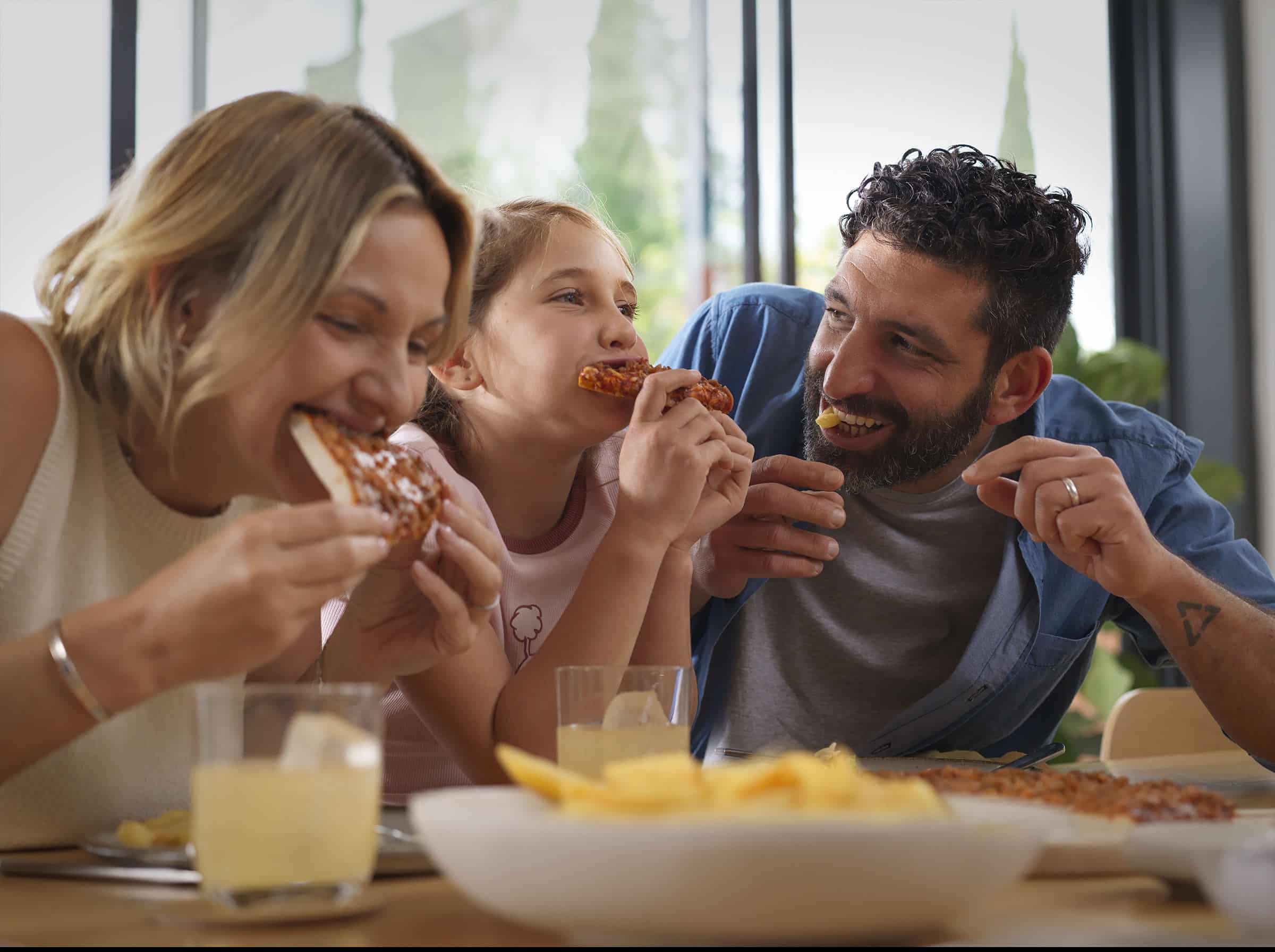
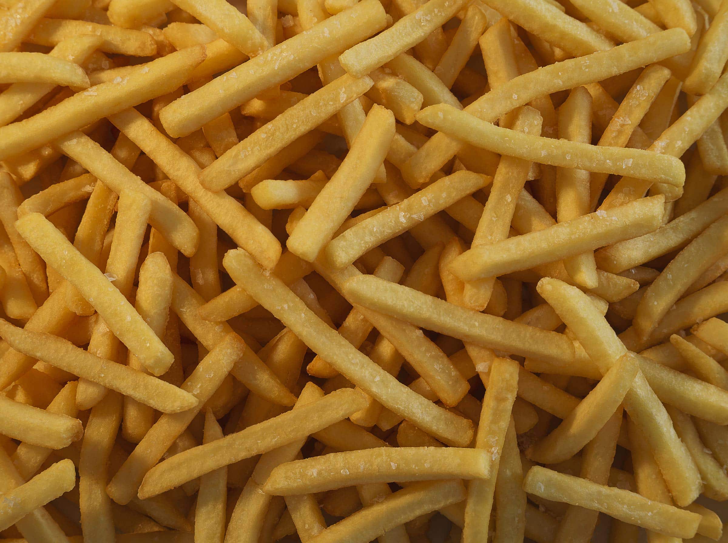
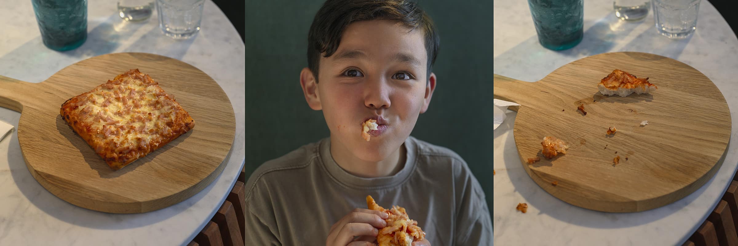
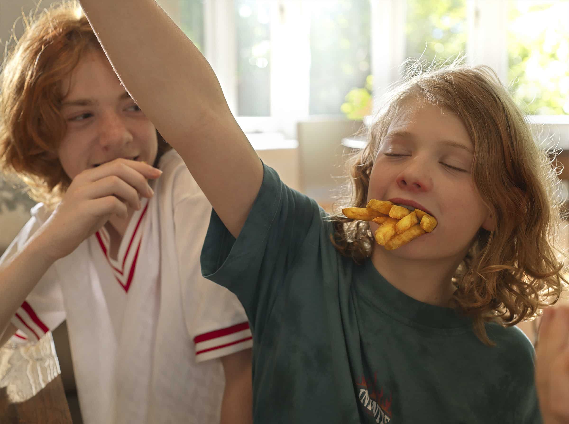
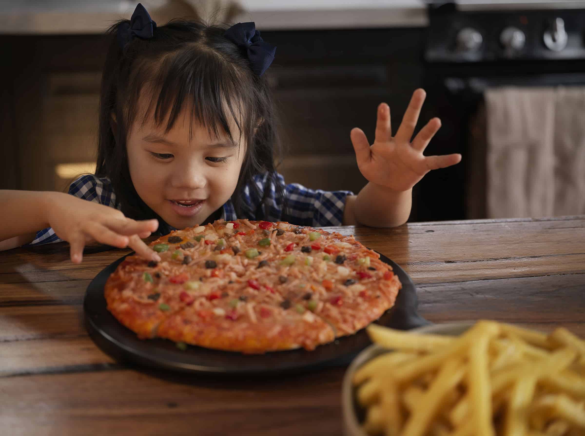
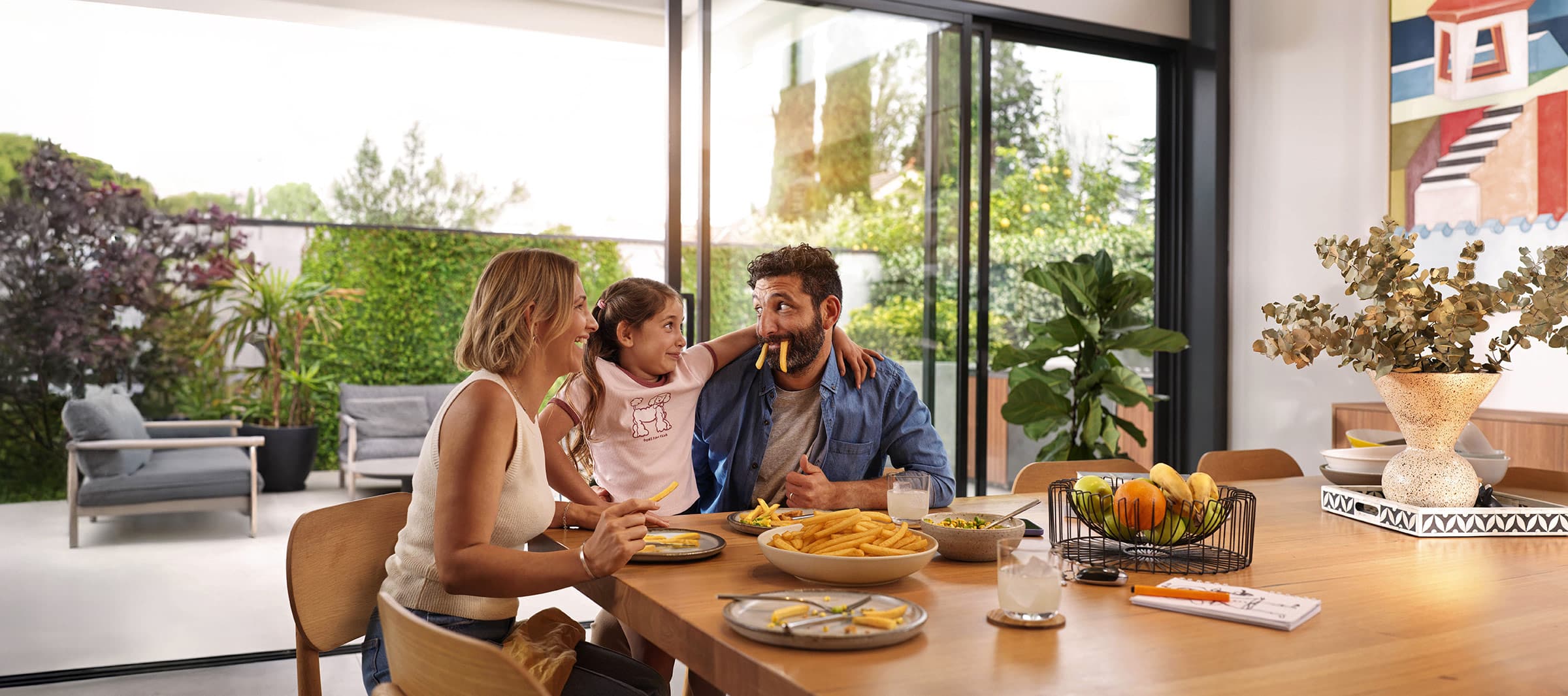
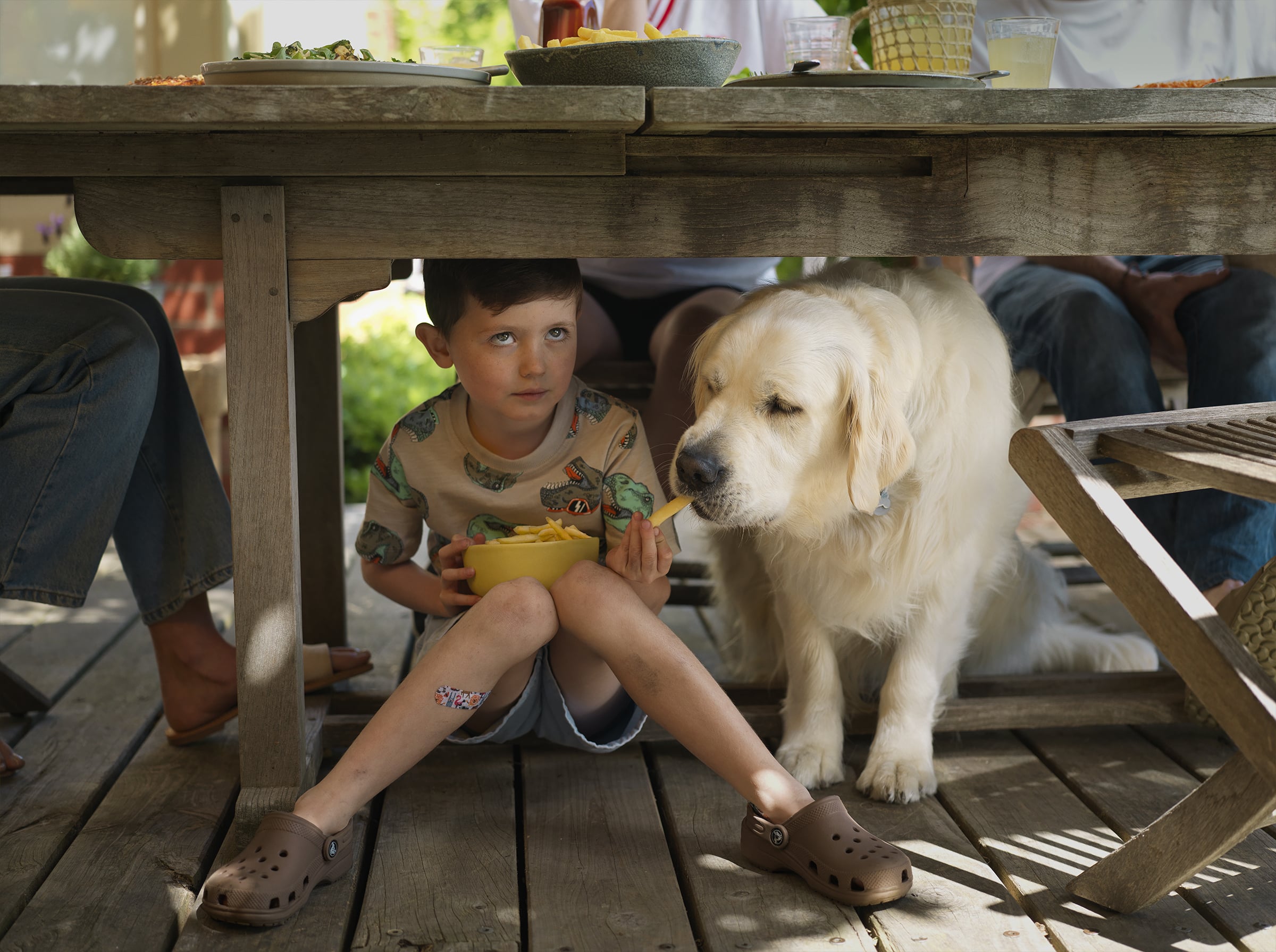
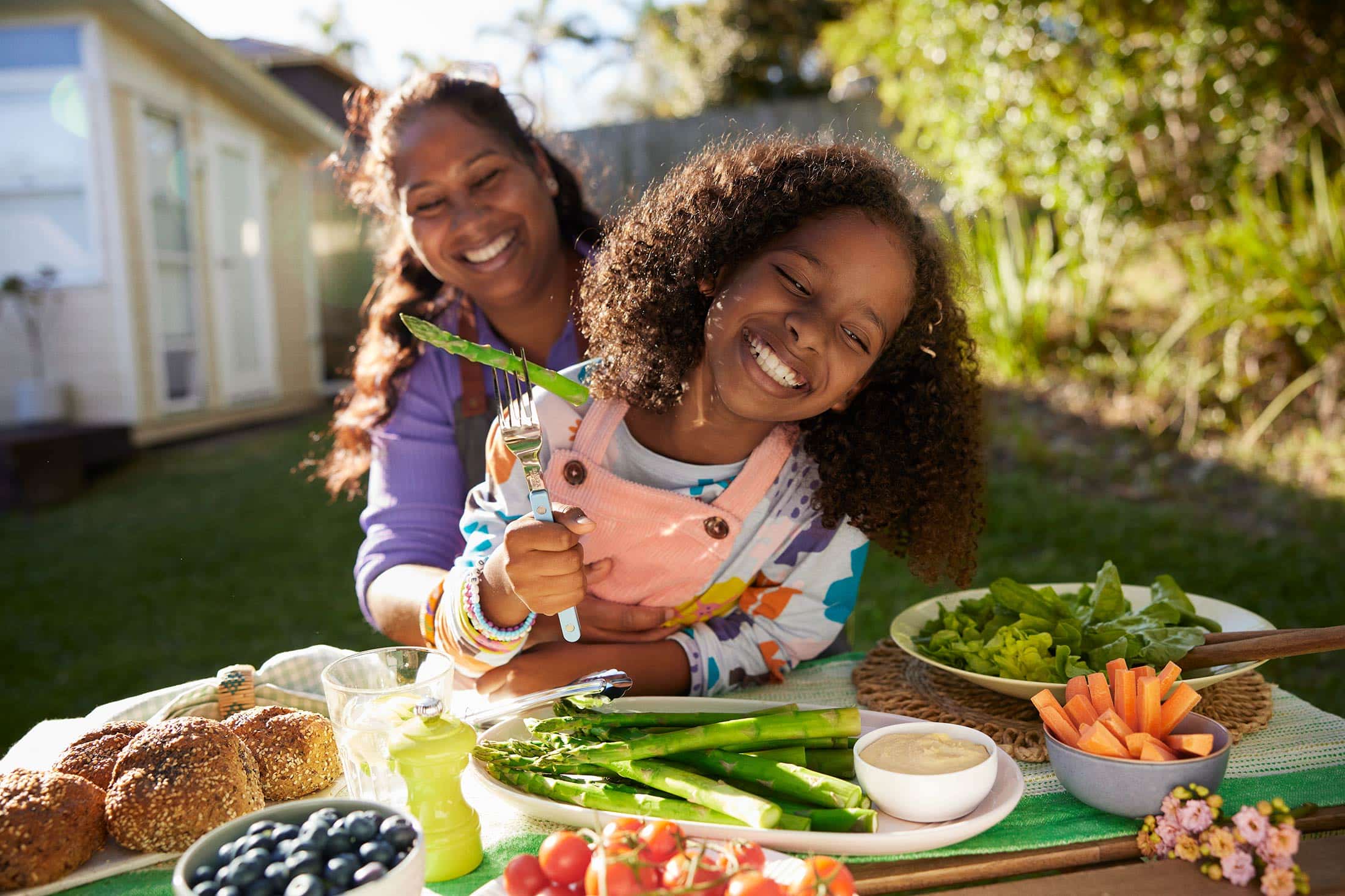
Shot over two days for McCain, balancing clarity and honesty. The outdoor heroes are clean and readable, strong expressions that land instantly on a billboard. The wider library leans the other way, quieter, more intimate, the kind of moments you catch just before or after something happens.
Natural light, minimal styling, and a loose approach with the talent. Kids sharing, grabbing, reacting. Nothing pushed, nothing overworked. Just enough control to hold the frame, but still let it feel like it’s unfolding in front of you.
Clear when it needs to be, real where it matters

This photographic series explores the waterways of Ku-ring-gai Chase National Park, a landscape that’s deceptively difficult to photograph

This is a custom heading element.
This is a place I keep going back to. I absolutely love it.
The waterways of Ku-ring-gai, where the Hawkesbury meets the sea. It’s only about 25 kilometres from Sydney, but it doesn’t feel like it at all. It’s wild, but still accessible. That’s what makes it special.
I’ve been shooting here for the last five or six years, and it’s actually a really hard place to photograph. In daylight it feels harsh. Shadows drop into black, the water blows out. Most of the time, it doesn’t give the camera much.
But when it all aligns, light, water, mist, the smallest ripples, you get something really special. You can almost capture the quiet that’s been sitting there for thousands of years.
It takes patience, which I don’t mind. A lot of the time I’m just sitting on the boat, waiting. Mostly first light or last light. And I love that you can’t force it. If it’s not right, I go home with nothing.
I shoot a lot, then come back and delete most of it. I don’t retouch these images. If a boat goes through, that’s it, you don’t shoot.
Coming from the commercial world, where everything is built, controlled and fast, this is the opposite. It’s slower, quieter.
There’s something incredibly special about being out there. It still feels untouched. Ku-ring-gai is the second oldest national park in Australia, and was established in 1876 and you can feel that history when you’re sitting there.
Yes, boat traffic can get pretty busy. But head out on a Tuesday morning in winter and you’ve got a very good chance of having one of those beautiful bays in Ku-ring-gai completely to yourself.
There are places where you’re far enough away that you don’t hear anything at all. Down at Bobbin Head you might catch the highway if you really listen. But there are spots where it’s just quiet. Properly quiet. And it’s pretty special.


There’s a calm and a quiet to it, right on the edge of Sydney, and it’s been sitting like that for thousands of years.
Working across multiple film and stills campaigns sharpens that understanding and pushes the work further
This is a custom heading element.
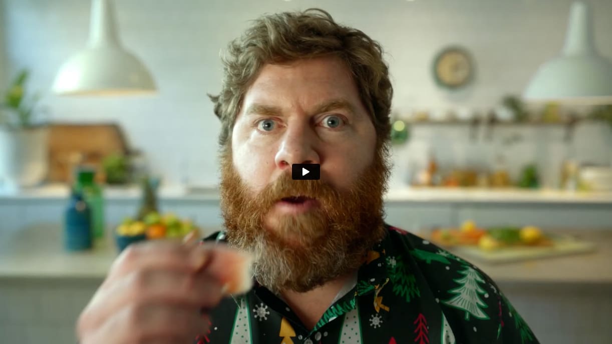
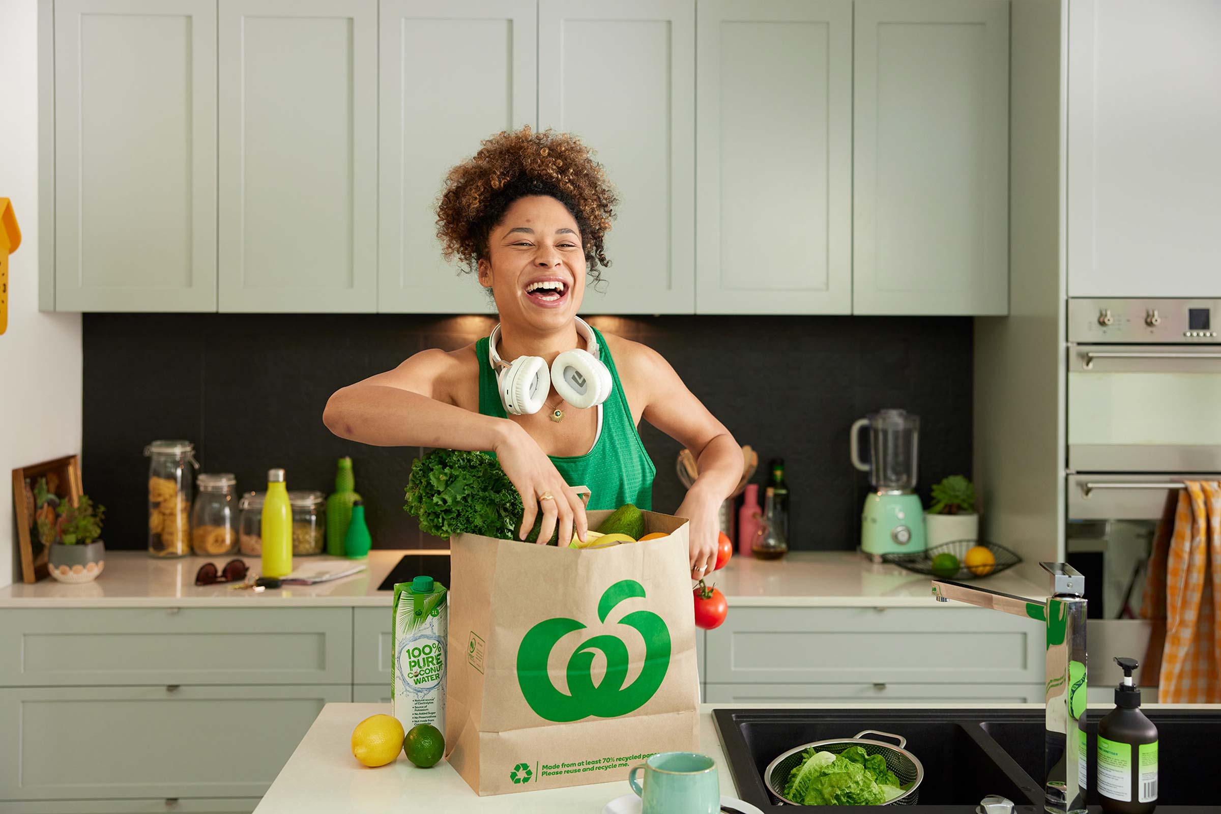
Over a period of time, I had the chance to work across a range of campaigns for Woolworths, including Christmas and Easter TVCs, alongside a broad set of stills. That continuity gave the work real depth. You start to understand not just the visual language, but how the brand speaks, how the creative thinks, and where the nuances sit.
The projects moved fluidly between different territories. Observational, human moments. Food that needed to feel immediate and real. And the build-out of stills libraries designed to carry consistency across a wide range of touchpoints. The aim was always the same. Keep it warm, keep it open, and keep it human. Avoid anything that feels overworked or overly constructed.
It’s a space where performance really matters. The difference between something that feels staged and something that feels lived-in is everything. At the same time, the images need to hold structure and clarity, especially when they scale across large campaigns.
We also built out a large stills library in the same tone, designed to hold consistency across everything.
I’ve always liked working across both film and stills on a project. It keeps the thinking aligned and the output tighter.


Working across multiple projects builds real understanding, and that benefits both sides. It’s not about loyalty for its own sake. Better work comes from that familiarity.
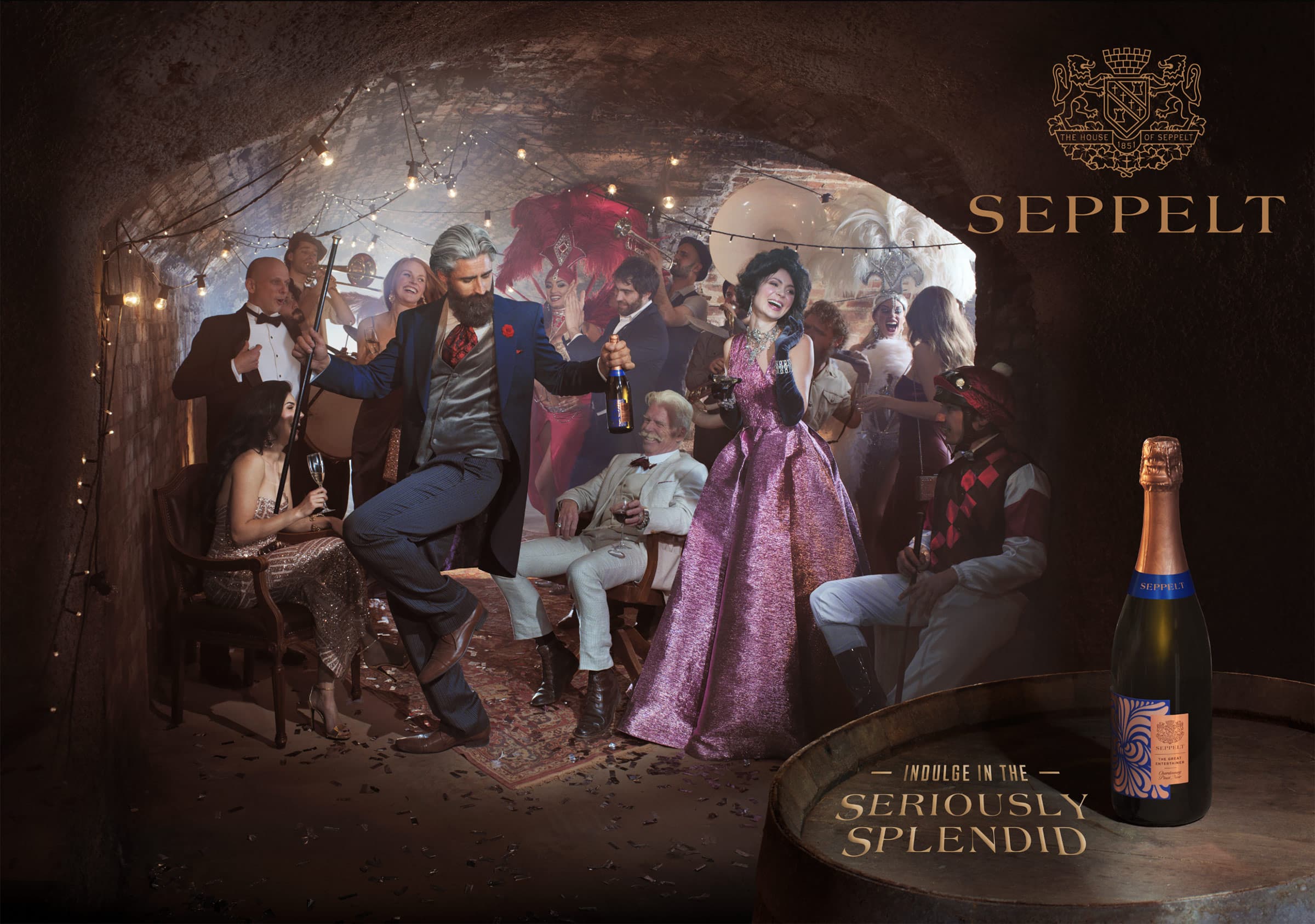
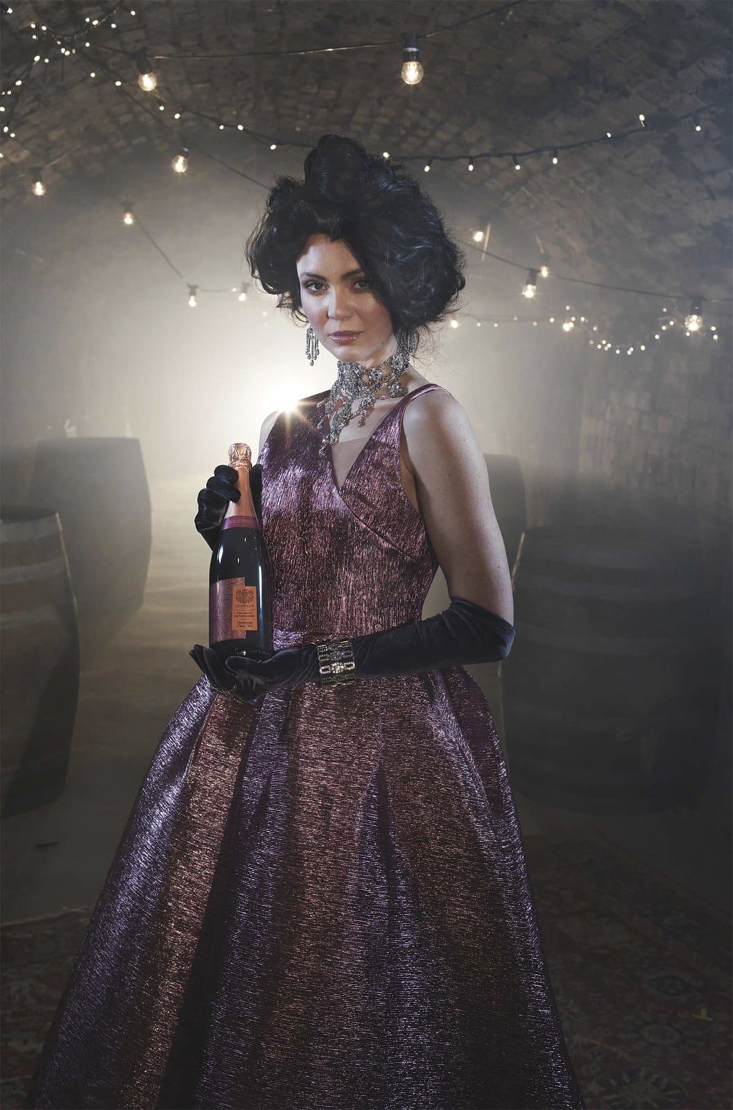
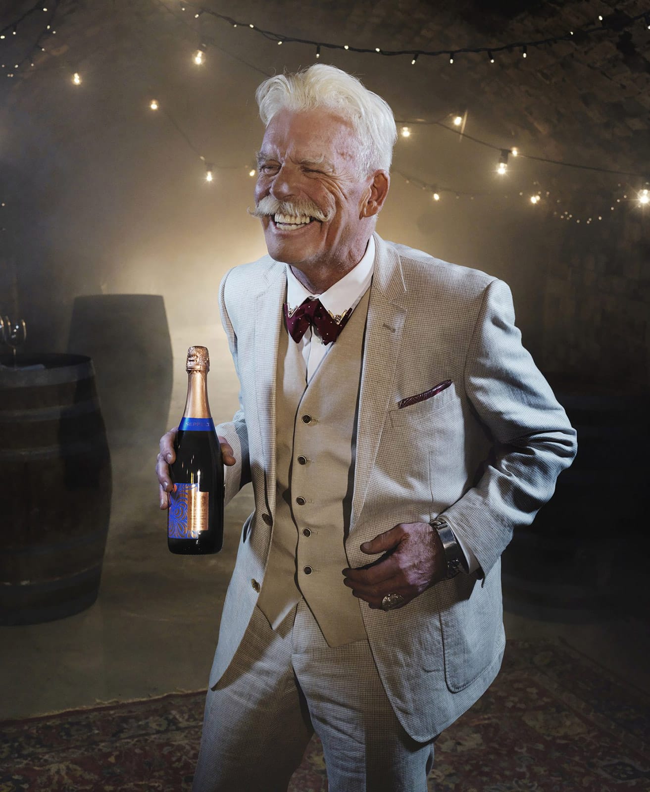
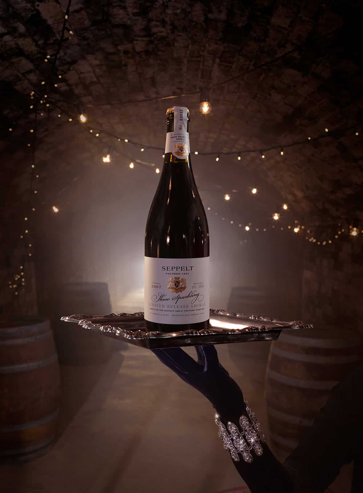
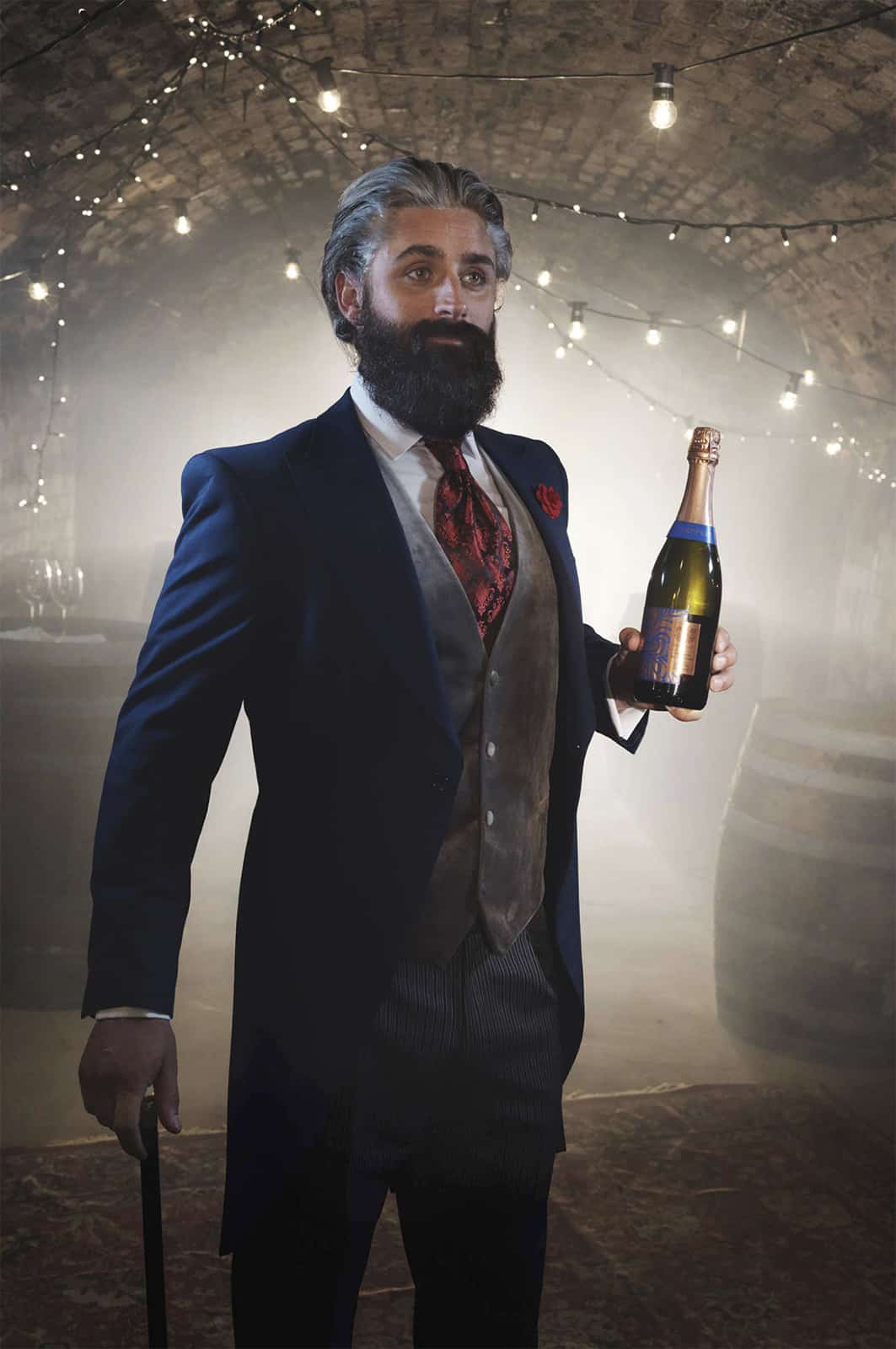
Seppelt Wines, a stills and film campaign inside the original underground cellars
This is a custom heading element.
Most of the work I do sits across stills and film, and I like when both come together. It allows for a much more cohesive result.
On paper, this was a simple campaign, but it quickly turned into something much bigger. The creative and client wanted to shoot inside the original underground cellars at Seppelt Great Western in Victoria. These tunnels, known as The Drives, aren’t really used in the same way anymore, so just getting access was a job in itself. Limited power, tough conditions, and a lot of gear to move through a pretty unforgiving space.
We initially approached it as a stills campaign, but once we got down there it became obvious how rich the environment was. The texture, the scale, the atmosphere, even the styling, it all had depth. It felt too good to only capture in stills.
So we expanded into motion. What started as print moved into a small film, which felt like the right response to the space and the story.
The winery carries a great history. Mark Twain visited Great Western in the 1890s. Dame Nellie Melba has her champagne bath legend, with the rumour that more bottles came out than went in. And Hans Irvine’s sparkling wine won gold at the 1900 Paris Exhibition. It’s that mix of serious wine history, folklore, and a bit of marketing spin that gives the place its character. We tried to capture all of it.
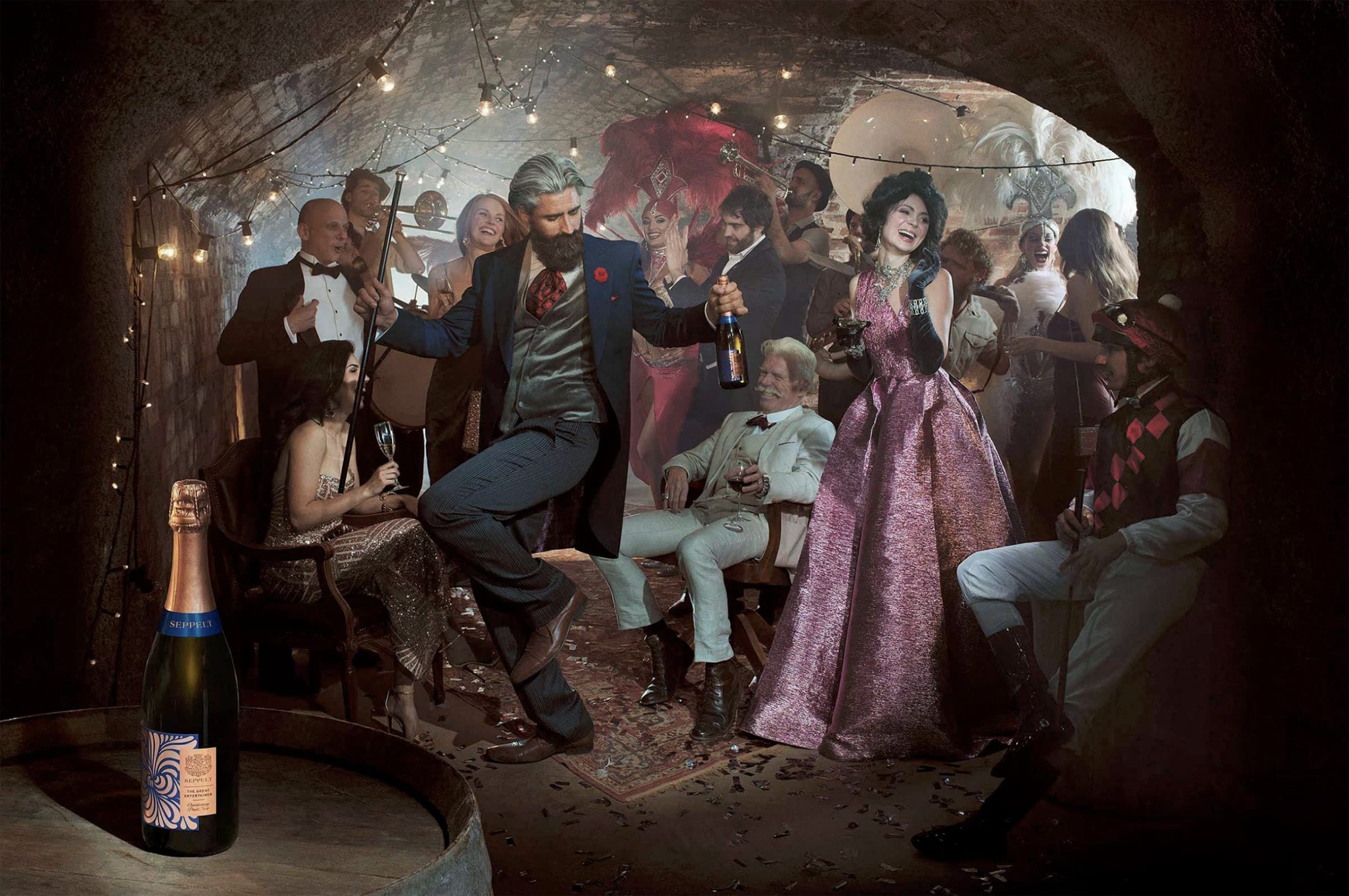
It felt like too good an opportunity to stop at stills. Moving into film, the camera just ate up the slow motion, all that texture and richness in the space we’d created.
There was something quite magic about being down there. We had a band playing live. Everything happened for real. It was hot, tight, and not exactly friendly. Spider webs everywhere, cables running through the tunnels, a proper grind.
But visually it was incredible. The production and styling were so well considered that every frame felt designed. Texture, depth, layers. Constant candy for the eye.
Easily one of my favourite projects. And honestly, what’s wrong with a bit of job satisfaction.
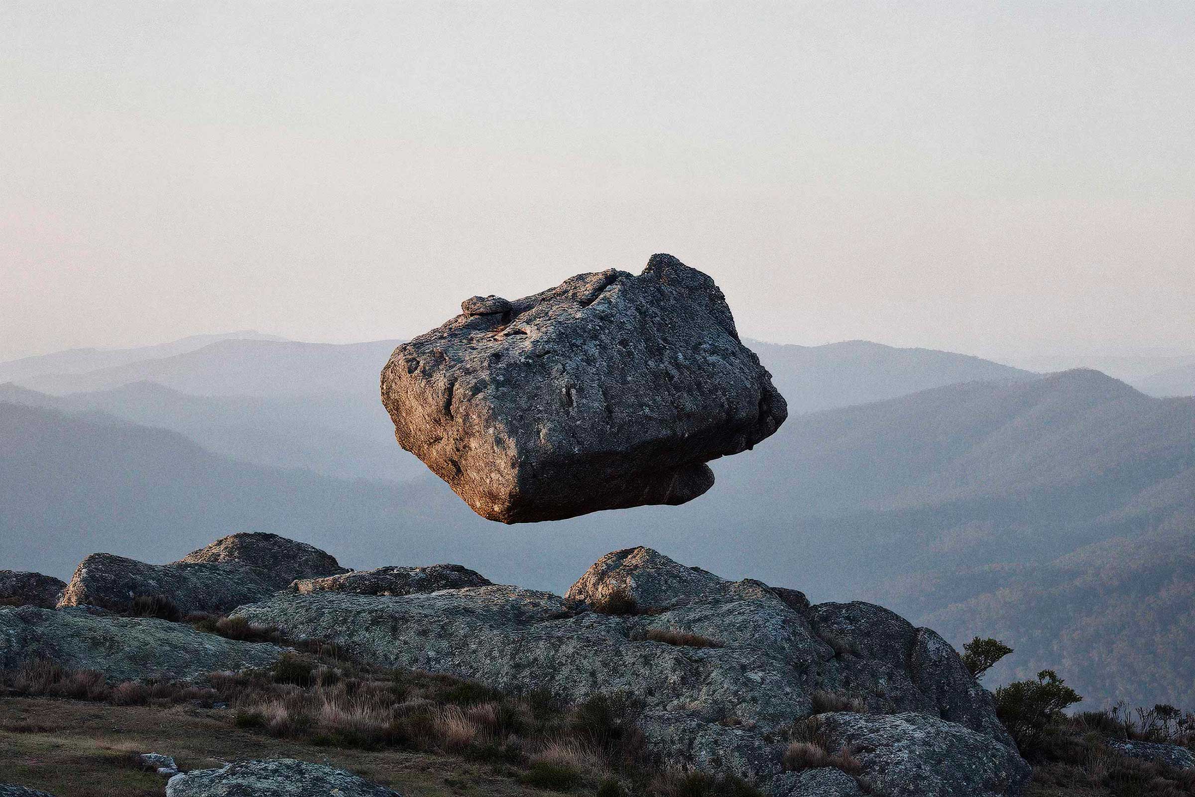
Light Weight Without consequence
This is a custom heading element.
These images started with a simple impulse. Why does everything always have to behave?
We’re used to things making sense. We want them to make sense. Gravity, cause and effect, politics, people in power.
There’s no drama here, no spectacle. Just a quiet shift that makes you look twice, and stay with it a little longer.
The boulders carry weight, and yet there’s a strange lightness to it. A calmness. It would be easy to make them move, turn it into motion. But they don’t need to. The idea holds in a single frame.
Maybe that’s the point. To just stand in front of something and look. Not on a small screen, but properly. At scale.
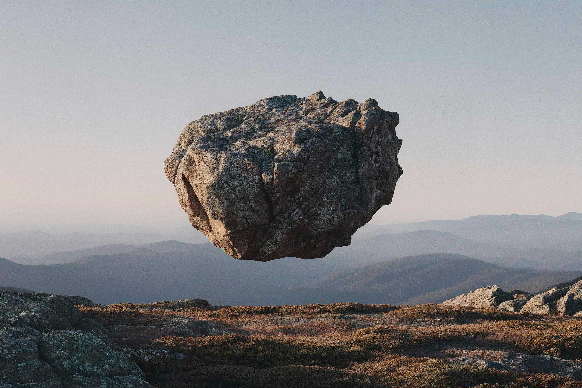
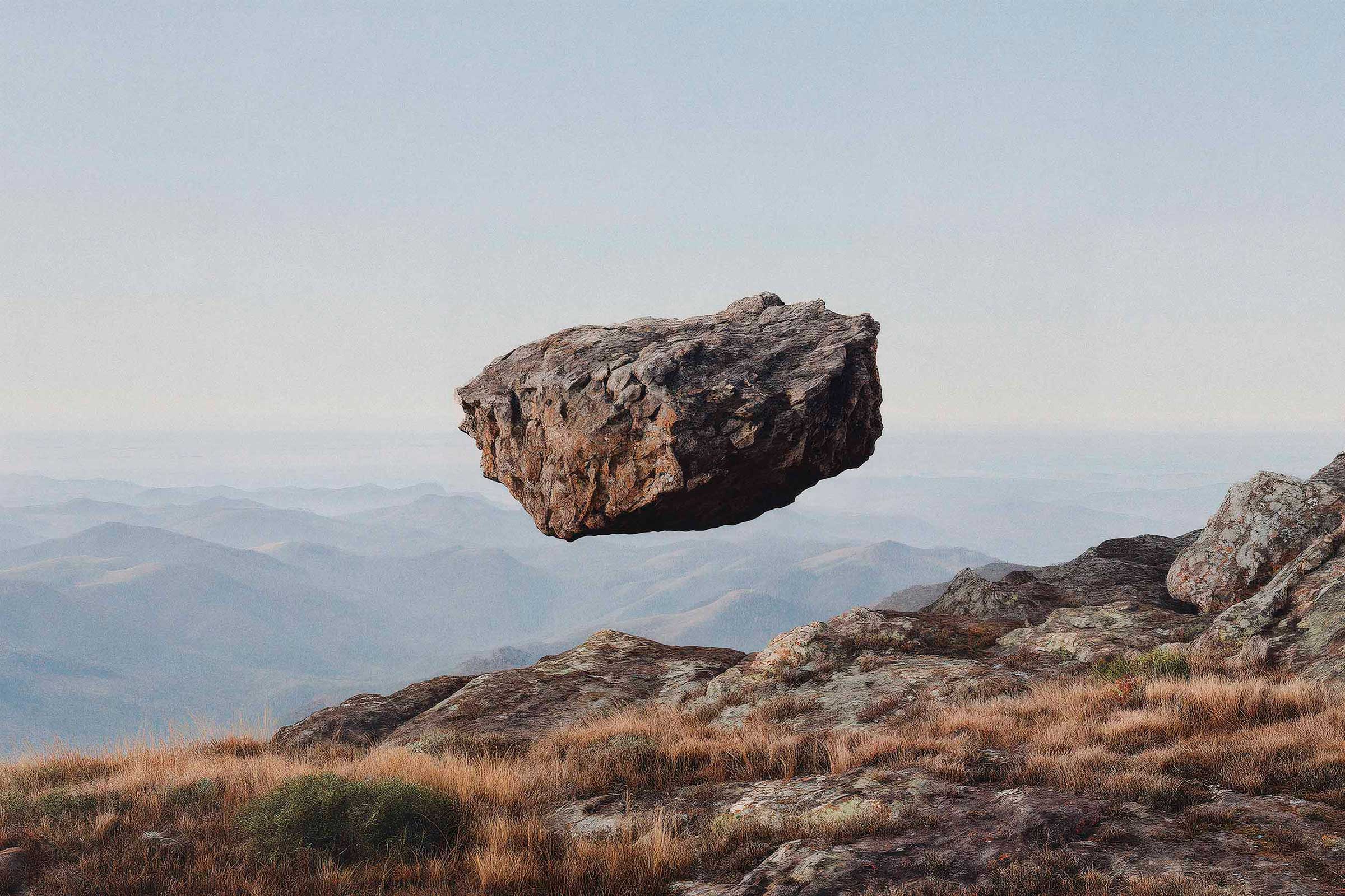
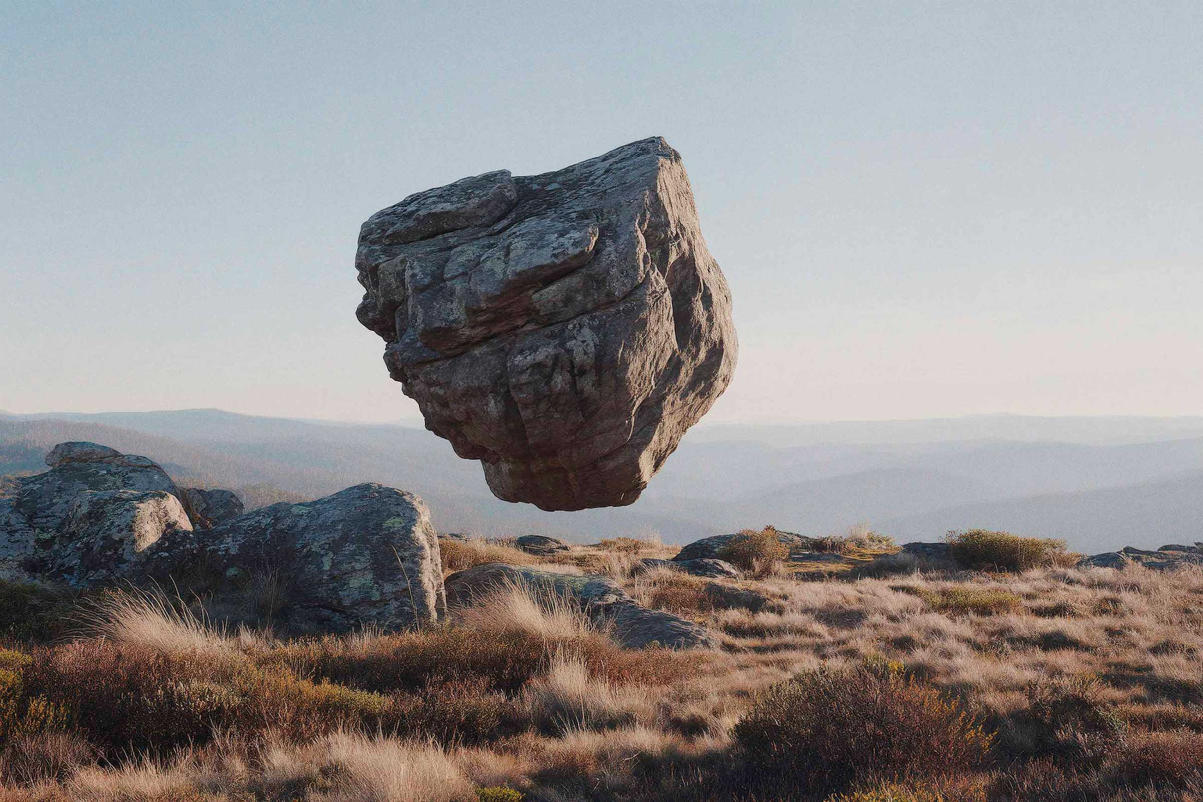
I find it’s often less about movement and more about presence.
I find it’s often less about movement and more about presence.

An integrated piece built between real and AI
This is a custom heading element.
An integrated piece built between real and AI.
The concept was developed in AI, shaped and directed in-house, then brought into the real world. Once it held, the watch came in and was photographed. Real light, real presence, treated with the precision it deserves.
The approach is simple. Something classic, something striking, without overcomplicating it.
AI was developed as part of the process, used where it adds value, then pulled back. Everything aligned into one language so it sits naturally with the photography.
One image. Clear, considered, with a sense of stillness and motion at the same time.
AI where it helps, photography where it matters.
AI where it helps, photography where it matters.
Performance, presence, character
This is a custom heading element.
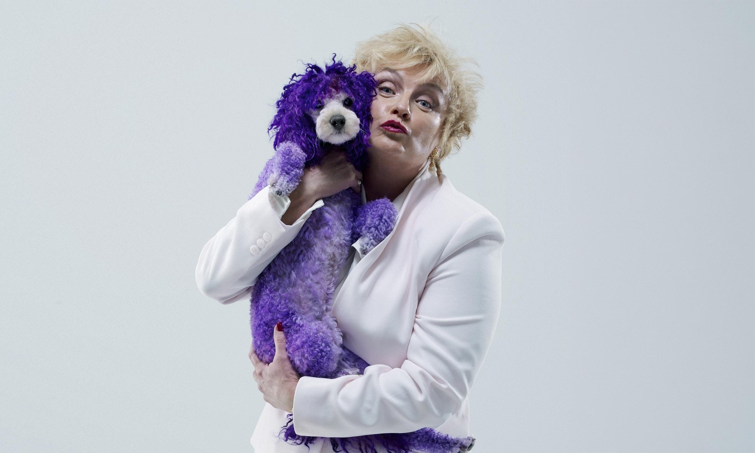
I love portrait photography. It’s been a big part of what I do over the years.
I’ve photographed everyone from well-known faces to artists I admire, to everyday people. Some of the work is stripped back and personal, some of it more constructed and polished through advertising. No matter the setup, the job stays the same. A good portrait is not just about what someone looks like, but who they are, how they carry themselves, what they stand for.
And I think that matters more than ever now. In a time where faces can be endlessly generated and manipulated, photographing a real person properly carries weight. You can feel the difference. A good portrait holds because there’s a real person in front of the camera, and a real person behind it.

I had the joy of photographing Barry Humphries as Dame Edna Everage. It was a long day and he wasn’t feeling great, but he held that full Dame Edna smile the entire time. Right at the end, I asked if we could do one frame with a very serious look. He absolutely loved it. Apparently, one of the very few times Dame Edna didn’t smile on camera.
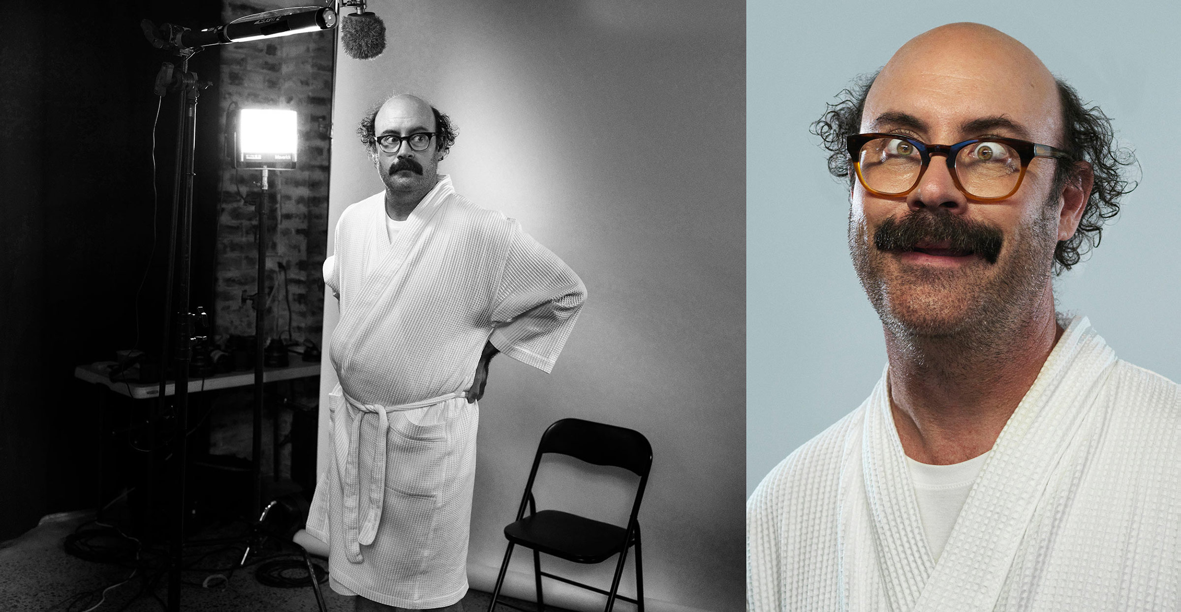
A portrait of Sam Simmons.
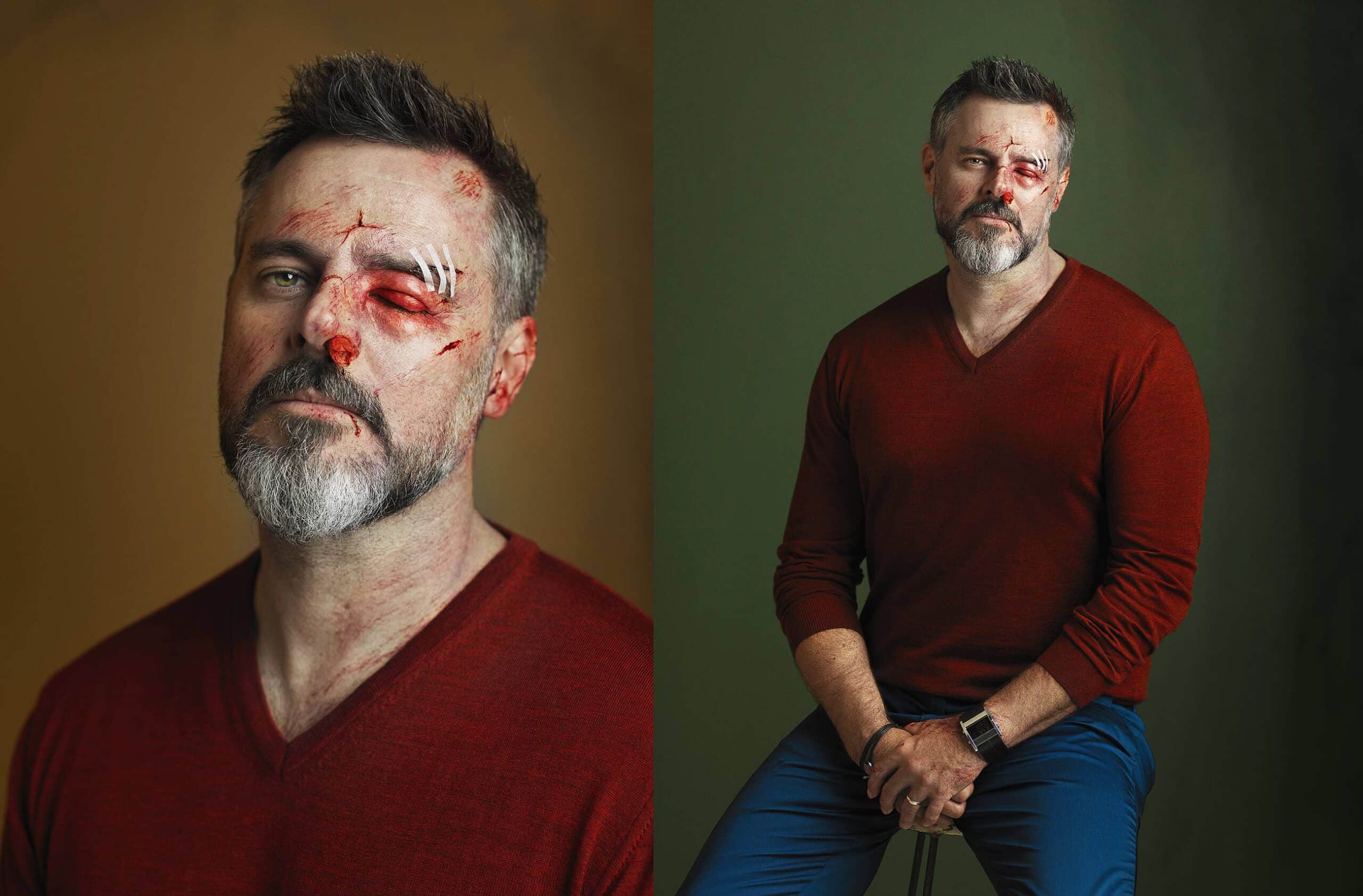
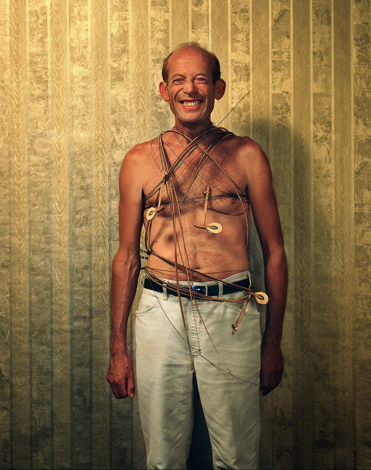
These portraits of Paul Nagy were photographed for a story about how hard the advertising industry can be at times. We pushed the idea visually, using special effects makeup, fake wounds and blood, but kept the portraits themselves very direct and clean. I like the clarity.


What a joy it was to photograph David Helfgott.
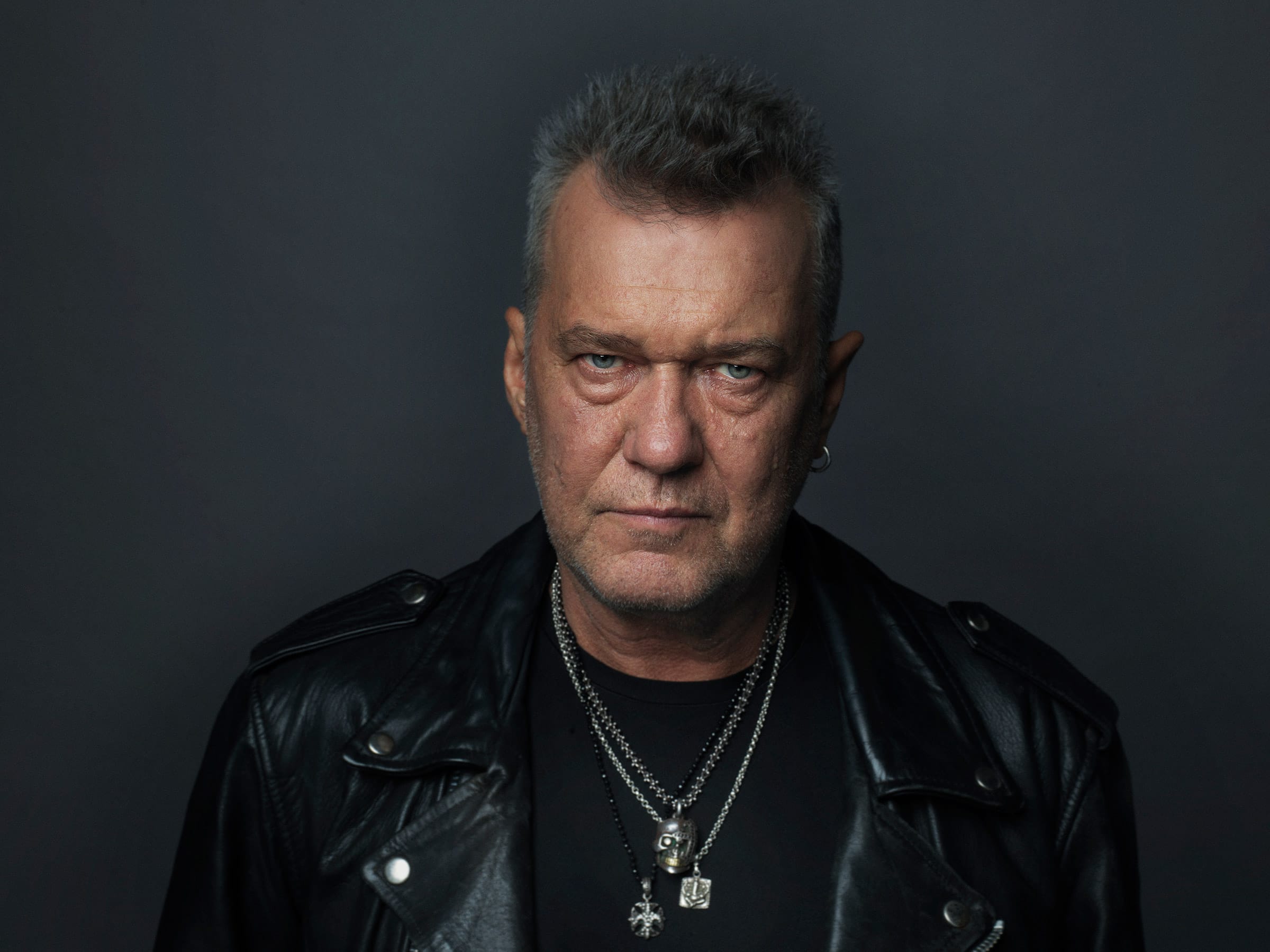
The Great Jimmy Barnes.


Snoop Dogg
I love the honesty of this series of wonderful kids I photographed. No styling, no production, no tricks, just personality, humour and all those little moments in between. Sometimes it works best when you stop trying too hard and simply leave enough space for people to be themselves.

A portrait of Sydney artist Anne Thompson, photographed in her atelier. We spend 4 hours with her and created a series of images.


I love the honesty of this series of wonderful kids I photographed. No styling, no production, no tricks, just personality, humour and all those little moments in between. Sometimes it works best when you stop trying too hard and simply leave enough space for people to be themselves.

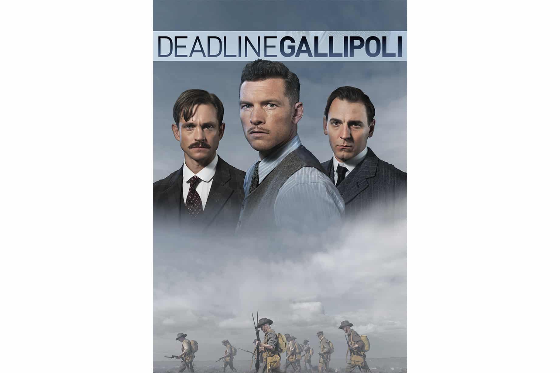
I photographed this portrait series for the SBS mini-series Deadline Gallipoli, featuring Sam Worthington, Hugh Dancy, Joel Jackson and Ewen Leslie.


A daylight portrait series of Australians photographed in the outback.
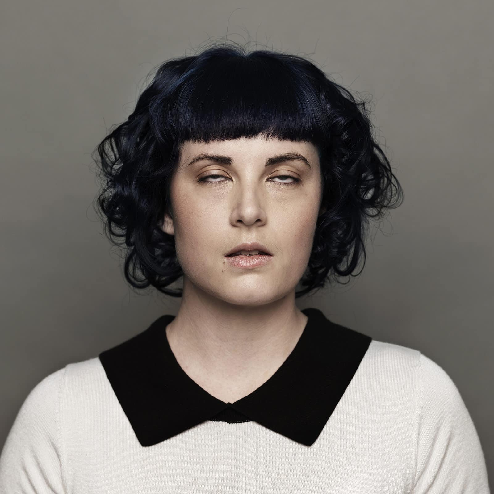
I’ve always loved this portrait for the exact moment it was taken. The image itself is carefully constructed, shaped and framed, yet what makes it different is that tiny instant where her eyes are half shut. That precise fraction of a second introduced something unexpected, human and slightly surprising into an otherwise very controlled portrait.